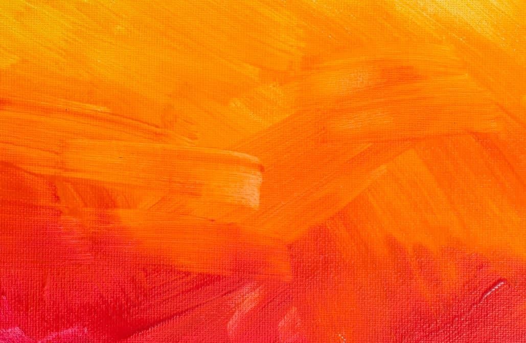
Orange sits right in the middle of the color wheel. It is the bridge between red and yellow. That makes it a secondary color. It is bright. It is energetic. It demands attention.
You might be looking at a blank wall and thinking about adding some heat to the room. Or maybe you want to accent a specific architectural feature. Before you buy a gallon, you need to understand how this hue behaves. It is not just “orange.” It is a spectrum. From pale apricot to deep tangerine, the difference changes everything.
Getting the shade right matters. A wrong choice can make a space feel chaotic or dated. A right choice adds warmth and vibrancy. Here is how to navigate the options without making a mistake.
Understanding the Spectrum of Orange
Not all oranges are created equal. The term covers a massive range of tones. Some lean toward the red side. These feel warmer. They feel more intense. Think of burnt orange or rust. These shades work well in spaces where you want coziness. They evoke autumn. They feel grounded.
Others lean toward the yellow side. These are lighter. They feel fresher. Think of peach or soft apricot. These are easier to live with. They do not overwhelm the senses. They work well in smaller rooms or areas with limited natural light. They reflect light rather than absorb it.
The intensity varies too. Some oranges are muted. They have a touch of gray or brown mixed in. These are sophisticated. They look like earth tones. They pair easily with neutral backgrounds. Others are pure and vivid. These are bold. They are statement colors. Use them sparingly. A single wall. A piece of furniture. Not an entire house.
Factors That Influence Color Perception
Light changes how you see paint. This is non-negotiable. Natural light shifts throughout the day. Morning sun is cool. Afternoon sun is warm. Artificial light adds another layer. LED bulbs can be blue. Incandescent bulbs are yellow. Your chosen orange will look different under each.
Test before you commit. Buy sample pots. Paint large swatches on the wall. Watch them change from morning to night. This is the only way to know how the color will behave in your specific space.
The surrounding colors matter too. Orange sits next to blue on the color wheel. They are opposites. This creates high contrast. It is energetic. It is modern. Pairing orange with blue can be striking. But it can also be jarring if not balanced.
Neutral backgrounds are safer. White walls let orange pop without competition. Gray walls soften the effect. Beige walls warm it up. Consider what you want the eye to do. Do you want it to rest or to dance?
Practical Steps for Application
Preparation is key. Walls need to be clean. They need to be smooth. Any holes or cracks should be filled. Sand the surface lightly. This helps the paint adhere. It ensures a uniform finish.
Primer is important. Especially if you are changing from a dark color to a bright orange. Or if you are painting over a glossy surface. Primer blocks stains. It provides a consistent base. It makes the top coat look better. It uses less paint.
Choose the right sheen. Eggshell is good for walls. It has a slight shine. It is
The Physics of Mixing Orange Paint
Getting the right orange starts with understanding that you are working with primaries. Specifically, you need red and yellow. These are the foundational pigments that don’t come from mixing other colors.
If you want a standard, medium orange, start with equal parts red and yellow. That is your baseline.
Want a different tone? Adjust the ratio. It isn’t a rigid science. It is tactile. You add more red for warmth. More yellow for brightness. You keep stirring. You watch the hue shift.
Lightening the Mix Without Losing Vibrancy
Many people try to lighten orange by adding white. This is where things often go wrong.
White dilutes the saturation. You end up with a pale, chalky version of orange rather than a vibrant light orange. If you must use white, use it sparingly. Add it drop by drop. Mix thoroughly. Test the color on a scrap piece of wood or drywall. Paint looks different wet than it does dry.
A better approach for a bright, light orange is to lean heavily into the yellow. Keep the red low. If you need it even lighter without the chalkiness, look for pre-tinted light orange base paints. But if you are mixing on the fly, patience is key. Rush the white, and you get beige.
Darkening Orange: The Brown Trap
Making orange darker is tricky. Add black paint directly? You will get brown.
The color wheel teaches us that orange and blue are opposites. Blue neutralizes orange. Add a tiny amount of blue to your dark orange mix, and it dulls. It becomes earthy. It becomes brown.
If you want a deep, rich orange without turning it brown, start with a medium orange. Add a touch of carmine or a deeper red. This shifts the balance toward the darker end of the spectrum while keeping the hue warm.
If you need it significantly darker, add black—but again, be extremely careful. A single drop can ruin the batch. Mix slowly. Check the lighting. Natural light is best for judging depth. Artificial light can hide muddy undertones until the paint is on the wall.
Creating Red-Orange and Yellow-Orange
You don’t just have one orange. You have a range.
Red-Orange
This is the warmest shade. It sits between red and orange on the color wheel. It feels energetic. Volcanic.
To make it, start with your equal parts red and yellow. Then, add more red. You want a ratio of roughly two parts red to one part yellow. It is bold. It dominates a space.
Yellow-Orange
This is the zesty option. It feels sunny. Fresh.
Start with equal parts red and yellow. Add more yellow. The ratio flips here: two parts yellow to one part red. It is brighter than red-orange. It reflects more light. It is ideal for accent walls where you want energy without the heaviness of red.
Pairing Your Custom Orange
You have mixed your perfect shade. Now what?
Orange is a secondary color, which means it has strong relationships with other hues.
- Analogous Colors: Stick with neighbors on the wheel. Yellow and red are obvious. But purple? Yes. Orange and purple create a vibrant, almost psychedelic contrast if used in equal amounts. Use purple as an accent.
- Complementary Colors: Blue is the direct opposite of orange. This is a high-contrast pairing. It is energetic. It can be overwhelming if you use large blocks of both. Use blue in trim, fixtures, or accessories. Let the orange be the star.
- Neutrals: White is safe. It makes orange pop. Gray is more modern. It tones down the energy of orange, making it sophisticated. Brown and beige work too, creating an earthy, grounded look.
- Green: A surprising but effective combo. Orange and green are energetic. Think of citrus or tropical themes. Use green in small doses to avoid a Halloween vibe.
Practical Tips for the DIYer
Mixing paint is not like mixing a drink. You can’t just stir and serve.
- Use the Right Base: Not all white paints are equal. Tinted bases react differently to pigments. If you are making a custom color, ask the hardware store for a neutral or white base suited for the sheen you want.
- Measure by Volume, Not Eyes: Use clear cups. Mark lines on the side. Eye-balling ratios leads to waste.
- Mix Thoroughly: Pigments settle. Stir from the bottom up. Use a drill mixer attachment for larger batches. Inconsistent mixing means patches of lighter or darker color on your wall.
- Test First: Paint a 12×12 inch square. Let it dry. Look at it in the morning light. Look at it at night. The color will shift.
- Buy a Tint Machine: If you are doing a whole room, hand-mixing three gallons is inefficient. Take your ratio to the store. Let the machine tint the entire batch. It ensures consistency.
You have the theory. You have the ratios. The rest is practice. Get your hands dirty. Make a mistake. Learn from the brown that wasn’t supposed to be brown. Then try again. The wall is waiting.