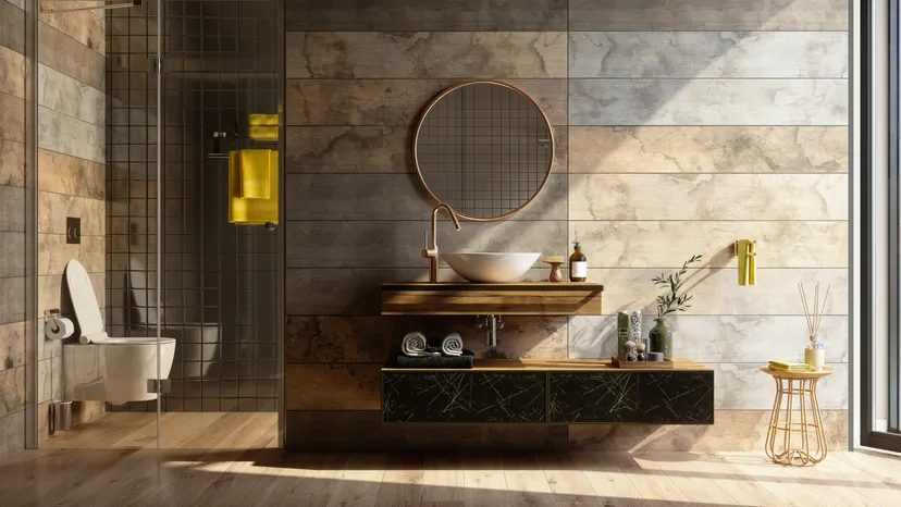
Every bathroom needs the same basic infrastructure to work. You need light that actually shows you what you’re doing. Ventilation that keeps mold at bay. Storage that doesn’t just exist but functions. And fixtures that look good without falling apart after a year of humid showers. The range of options is massive. From the spa-like retreat in the master suite to the cheerful, kid-proof room down the hall, the core requirements don’t change.
You don’t need a fortune to get a high-end look. Traditional fixtures come in every price tier. Homeowners who want the marble floor aesthetic but can’t afford the stone can use faux-marble ceramic tiles instead. It looks nearly identical from a few feet away. It costs a fraction of the price. It holds up just fine.
The real trick is knowing which design style fits your space and your habits. Below are specific approaches to bathroom decor, broken down by aesthetic and practical need.
Safety with Style
Safety often feels like a compromise. It shouldn’t be. Modern designers know how to blend function with form. You can install grab bars that look like decorative hardware. You can use no-scald faucets without sacrificing sleekness. Rounded corners on counters prevent injuries. Slip-resistant surfaces protect everyone. These features benefit all ages. They make the room safer without stripping away character.
Minimalist Decorating Tips
If your bathroom is small, clutter is the enemy. Minimalism isn’t just a trend; it’s a spatial solution. Understatement helps small rooms feel larger. The goal is to get the most from a minimal footprint. This means clean lines. Smooth surfaces. A lack of physical clutter. For true minimalists, the bathroom is the ideal starting point. When there’s nothing to trip over or knock down, the room becomes easier to use and inherently safer.
Clean Lines and Order
Defining a space with smooth, clean lines creates a sense of order. It’s not about being cold. It’s about clarity. This approach works well for those who want a bathroom that feels organized. It pairs well with the “Cutting-Edge Contemporary” look, where shapes and edges play a starring role. Imagine branched quartzite from Brazil used for flooring. It creates a sophisticated, sharp aesthetic that feels modern but grounded in natural stone.
Traditional and Victorian Styles
Traditional styles have withstood the test of time for a reason. They offer dignity and grace. You can achieve this look using ceramic tile, marble, fabric, porcelain, and even wood. For a Victorian nod, think romance. Bring the look of a vintage home into the bath. Use accessories that match a royal era for a literary, romantic feel. It’s about adding warmth and history to the space.
The Master Bath and Custom Cabinetry
Master baths tend to be more opulent than family baths. Consider custom cherry cabinets. They are elegant without being ostentatious. Use open shelving to display your most valued items. Keep the rest tucked away. Built-in storage is key. Drawers for small items. Cubbies for towels. Simple neutral palettes and straightforward cabinetry that can be painted or stained as your taste matures are ideal. This ensures the room stays relevant as the family grows.
Southwest Ranch and Nature-Inspired Looks
The Southwest Ranch style relies on ageless materials. Strong, simple good looks. It creates a feeling of free-spiritededness with welcoming comfort. If privacy isn’t an issue, look to the outdoors. Natural backdrops create instant ambiance. Use the environment to inspire the indoor space. Rich wood and a neutral palette can turn a bathroom into an oasis of tranquility.
Color and Pattern
Fields of strong color play well against bright white fixtures. Color coordination makes a world of difference in a contemporary space. Even if you commit to a strongly colored wall in a permanent material, white fixtures give you maximum leeway to change the scheme later. For the bold, consider a riot of stripes, triangles, and related shapes. It creates an optical illusion. It’s a fearless design choice.
French Provincial and Romantic Décor
Invoke the spirit of Marie Antoinette. Use the refined elegance of French Provincial styling. It’s coquettish and refined. A small space is perfect for this kind of romantic setting. It reflects long-ago times. Choose accessories carefully to maintain the look.
Contemporary and Transitional Styles
Contemporary decorating balances a “modern” look with traditional styles. It’s cool and clean. Casual yet elegant. Smooth fixtures and complementing curves create a glamorous bathroom that doesn’t break the bank. Transitional styles sit right between traditional and contemporary. They often have eclectic and ethnic tones. Think of it as a bridge.
Far East Aesthetic
A bath inspired by timeless Chinese aesthetic is dramatic, restrained, and simple. Create this look using Cinnabar, the rich red color of Chinese lacquer. It’s exciting. It’s distinct. It stands out without shouting.
Thoughtful Touches
Beyond the big design choices, small details matter. A shaving mirror mounted above the sink is always appreciated. Towel warmers add luxury. Hand-held shower heads offer flexibility. These thoughtful touches make the daily routine smoother.
Planning Your Zones
Plan your bathroom with your particular habits and tastes in mind. Break the room into three fundamental areas:
* The bathing and showering area
* The sink and grooming area
* The toilet area
Each zone should serve its purpose efficiently. Safety measures like slip-resistant surfaces and rounded corners benefit everyone. Guest-room baths and powder rooms can be more decorative. Family baths need to be planned to grow along with the kids.
Start with the basics. Get the lighting right. Ensure the ventilation is strong enough. Pick fixtures that match your budget and your style. The rest is just decoration.
Maximizing Flow in High-Traffic Family Baths
Split the tub and shower to keep morning chaos at bay. An angled shower unit hugs the corner, reclaiming floor space that a standard stall would swallow whole. Extend the vanity countertop the length of the wall, varying the depth to create distinct zones without blocking the path to the door. Open floor space feels less claustrophobic when kids are darting between tasks. A private toilet enclosure isn’t just a luxury; it’s a necessity when parents and children are all rushing out the door at once.
Bright Surfaces and Smart Storage
Light is the best friend of a small room. Choose maple cabinets, stainless-steel sinks, and polished-chrome faucets to bounce illumination around the space. This approach keeps a contemporary bathroom feeling airy and uncluttered. If your taste leans traditional, white wainscoting paired with white brick tile delivers that same dazzling, expansive effect.
Organization needs to be built-in, not an afterthought. Install a vented laundry hamper directly beside the sink—laundry day stops being a trek across the house. For little ones, a fold-away step stool is essential for reaching faucets, yet it vanishes when not in use. Hang hooks at a height that accommodates every family member’s robe, and assign specific shelves or drawers to each person. Everyone has their place.
The Strategic Power of Powder Rooms
Powder rooms may lack square footage, but they make up for it in usability. Place one strategically next to an office or den to serve as a guest bath without dragging visitors through private living areas. If the room sits near a formal living room, mirror that style. Use faux-finished wall treatments and gold or brass fixtures to create a cohesive aesthetic.
Basement powder rooms offer more creative liberty. Try paneling, or go wild with bold colors and flea-market finds. An iron shelf above a pedestal sink adds industrial chic. Pair retro plastic chairs with colored tiles for a look that’s playful yet polished.
Designing for Two
A sanctuary meant for two people should suit both. Dual sinks are standard, but consider back-to-back placement if side-by-side doesn’t fit the layout. Separate recessed medicine cabinets prevent the daily tug-of-war over shelf space. Install vanities at comfortable heights for both adults, and if space permits, include twin dressing areas. Experiment with materials, colors, and textures to craft a unique look that reflects your shared style rather than compromising.
Connecting with the Outdoors
Natural light changes everything. A grand skylight or windows placed beside the tub and inside the shower allows you to commune with nature while bathing. It leaves the troubles of the day behind, at least for a while.
Theme-Specific Inspiration
We’ll explore decorating ideas for various bathroom themes, from minimalist to traditional Victorian. Discover how to give your bathroom a tasteful décor that matches your home’s character.
For more tips on creating spaces you love:
- Kitchen Decorating Ideas
- Dining Room Decorating Ideas
- Decorating Ideas
- Home Office Decorating Ideas
- Decorate Home Spaces Ideas
- Interior Decorating
- Home Decorating Tips
- Decorating Kids Rooms
- Decorating Styles
- Bathroom Décor
- Bathroom Decorating Ideas
- Designing a Bathroom
- Decorating a Bathroom
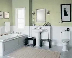
Balancing Eras in Bath Design
Black frames feel out of place in stuffy, traditional spaces. They ground the room. Here, they bridge the gap between old-world charm and modern minimalism. The result is a bath that feels elegant but not heavy. It avoids the museum vibe by mixing fixtures that look current with ones that look timeless.
Take the hardware. The whirlpool, the toilet, the sink—they all have a sleek, high-style profile. They fit today’s architecture without trying too hard. White fixtures remain a safe bet. They don’t go out of style. Chrome accents add the necessary gleam. Pearly gray marble underfoot? That’s the touch of luxury that ties it together.
Then there’s the color. Soft green walls whisper that this space is timely. Green, in any shade, is a classic. It never truly leaves the room. And let’s not forget the light. An undressed window floods the space. Natural light is non-negotiable for a good bathroom.
But style isn’t enough. You need safety.
Safety Without Sacrificing Style
Decorating guidelines matter. They ensure the room looks good and works safely. Everyone who uses it needs to be protected. Slip hazards, sharp corners, poor lighting—these are the enemies of a beautiful bathroom.
Start with the floor. Marble is gorgeous but slippery when wet. Choose a textured finish or use a non-slip coating. If you’re painting walls, pick a semi-gloss or gloss finish. It resists moisture and is easier to clean than matte.
Fixtures need to be secure. Grab bars are not just for hospitals. Install them near the toilet and in the shower. They can be stylish, too. Matte black or brushed nickel matches the frame and the chrome accents.
Lighting is key. Place lights on both sides of the mirror. Overhead lighting casts shadows on your face. Side lighting is flattering and safe for shaving or applying makeup.
Consider the threshold. A step-up into the shower is a tripping hazard. If possible, level it out. If you can’t, add a clear, non-slip mat.
Finally, keep clutter to a minimum. Clutter leads to accidents. A clean surface is a safe surface. Use recessed shelves for toiletries. Keep the floor clear.
This approach doesn’t just look better. It lasts longer. And it keeps you from ending up in the ER.
For more ideas on how to make your home both beautiful and safe, check out these resources:
- Kitchen Decorating Ideas
- Dining Room Decorating Ideas
- Decorating Ideas
- Home Office Decorating Ideas
- Decorate Home Spaces Ideas
- Interior Decorating
- Home Decorating Tips
- Decorating Kids Rooms
- Decorating Styles
- Bathroom Décor
- Bathroom Decorating Ideas
- Designing a Bathroom
- Decorating a Bathroom
- Kids Bathroom Decorating Ideas
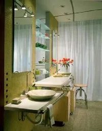
Beauty means nothing if the floor becomes a hazard. You need a space that works for everyone. The National Kitchen and Bath Association (NKBA) lays out specific universal design bathroom tips to ensure longevity and safety. This isn’t just about compliance. It is about making the room usable for children, seniors, and anyone with physical limitations.
Start with the basics. Handy grab bars are non-negotiable for stability. Wider doorways allow for easier movement, accommodating wheelchairs or walkers without forcing a narrow squeeze. If you are replacing the tub, look for whirlpool models with fold-down seats. These features are smart investments today and will serve you well decades from now.
Style does not have to die for safety. You can have both. Consider a wall-mounted lavatory. It offers the clean look of countertop installation while leaving ample space underneath. That extra room is key for wheelchair accessibility. It proves you can have a stunning bathroom that doesn’t exclude anyone.
Flooring deserves attention, too. Nonslip finish tiles are essential. They provide traction when wet, reducing the risk of falls. Color matters here as well. Current trends favor cheery citrus-greenish-yellow tones. These bright, sunny hues keep the space feeling open and lively, rather than clinical or sterile.
If you prefer a cleaner aesthetic, minimalist bathroom design is the way to go. Remove visual clutter. Stick to simple lines and neutral palettes. This approach reduces the chance of tripping over loose rugs or cluttered corners. It also makes cleaning easier, which is a significant plus for aging in place.
Essential Safety Features for Universal Design
When planning your renovation, focus on these critical elements to ensure the space is truly safe:
- Grab Bars: Install them near the toilet and inside the shower. Ensure they are anchored into studs, not just drywall.
- Door Widths: Aim for doors at least 32 inches wide. This allows for easy passage of mobility aids.
- Non-Slip Flooring: Choose tiles with a high coefficient of friction. Avoid polished stone in wet areas.
- Seating: Include a built-in bench or a fold-down seat in the shower. This allows users to sit while bathing.
- Lever Handles: Use lever-style faucets and door handles instead of knobs. They are easier to operate with limited hand strength.
Achieving a Minimalist Look
Minimalism is more than a trend. It is a practical choice for a safe bathroom. A clutter-free space reduces visual noise and physical hazards.
- Choose Simple Fixtures: Opt for faucets and showerheads with clean, geometric shapes. Avoid ornate details that trap dirt and water.
- Limit Decor: Use only a few meaningful items. A single plant or a piece of art can add personality without creating clutter.
- Smart Storage: Use recessed shelving in the shower or under the sink. This keeps toiletries out of the way and reduces the need for freestanding cabinets that can be tripped over.
- Neutral Colors: Stick to whites, grays, and soft beiges. These colors reflect light and make the space feel larger and cleaner.
- Hidden Lighting: Use LED strips under cabinets or behind mirrors. This provides ample light without creating harsh shadows or bulky fixtures
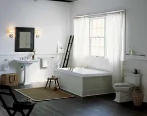
Balancing Vintage Aesthetics with Modern Functionality in Bathroom Design
The result is a bathroom where the dark floor anchors the room, creating a striking contrast against the predominantly white, bead-board paneled walls. This specific dark-floored bathroom design achieves a pleasing harmony between eras, grounding the space while allowing the architectural details to breathe. The owners selected streamlined fixtures that clearly evoke the Art Deco influences of the 1920s and 1930s. Yet, by integrating these vintage-style pieces into a crisp, white-on-white scheme, the overall effect shifts. It becomes less about nostalgia and more about an understated contemporary tone.
For furnishings, the goal was simplicity. The right bathroom accessories for beadboard walls need to complement the pale paneling without competing with it. Instead of adding visual noise, the chosen pieces serve to add interest. This approach ensures that the room remains airy and spacious, despite the heavy floor.
Selecting Complementary Fixtures and Hardware
When choosing fixtures for this type of high-contrast, paneled space, scale matters. The streamlined shapes prevent the room from feeling cluttered. Look for hardware with clean lines rather than ornate detailing. This keeps the focus on the texture of the beadboard and the depth of the floor.
The key is to let the materials speak. A dark floor demands attention, so light fixtures and white surfaces keep the balance from tipping too heavily into darkness.
Consider the finish of your faucets and towel bars. Brushed nickel or matte black works well here, bridging the gap between the historical vibe of the 20s and the modern simplicity of today. Avoid shiny chrome if you want to maintain that understated, contemporary feel. The goal is a room that feels curated, not crowded.
Maintaining the Beadboard Integrity
Beadboard in a bathroom requires careful material selection. Ensure the paneling is properly sealed or made of moisture-resistant PVC if you are renovating. Traditional wood beadboard can warp in high-humidity environments. If you are keeping original wood, use a high-quality semi-gloss paint or a marine-grade varnish. This protects the pale finish from steam and splashes while maintaining the clean look that defines the space.
The simplicity of the furnishings allows the architectural elements to take center stage. It’s a practical choice for homeowners who want character without the upkeep of a fully antique restoration.
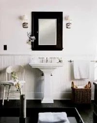
Consider the practicality hidden in plain sight. A dark-stained wooden ladder does double duty, serving as both a decorative anchor and a functional rack for extra towels. Next to it, a tiny wooden stool acts as a makeshift side table for the tub, while a woven basket tucks away the clutter of supplies. The medicine cabinet has ditched the traditional white finish for a dark stain, creating a sharp, intentional contrast against the brilliant walls.
Why Clean Lines Matter in Small Spaces
The real showstopper remains the bathing area, defined by an abundance of windows. Sheers are the go-to solution here, gaining traction in the 21st century for their ability to simplify spaces. These simple fabrics diffuse harsh light, transforming the tub into an oasis of calm. But achieving that serene vibe requires more than just window treatments.
Do you want a bathroom that looks clean all the time? It starts with how you arrange the room. The goal is to strip away the unnecessary. Less visual noise means more peace. You don’t need a huge budget to make this happen. You need to decide what stays and what goes.
Achieving the Clutter-Free Look
To maintain this aesthetic, you have to be ruthless with your storage. Every object needs a place. If it doesn’t have one, it becomes visual chaos. The ladder, the stool, the basket—these aren’t random additions. They are targeted solutions for specific problems. Towels need hanging space. Small items need hiding spots.
This approach works because it prioritizes function without sacrificing style. The dark wood grounds the room. The white walls open it up. The sheers soften the edges. It is a balance of textures and tones.
When you look at your own bathroom, what is the first thing that catches your eye? Is it a pile of towels? A cluttered counter? Or is it the clean line of a well-placed mirror? The difference lies in the details. You can start small. Clear the counters. Add a single piece of functional decor. See how the space breathes.
If you want to explore other areas of your home, there are plenty of resources for updating your kitchen, dining room, or office. But the principles remain the same. Keep it simple. Keep it clean. The rest follows.
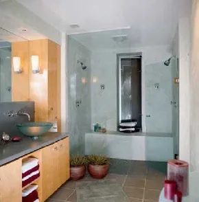
Expanding Small Spaces with Color and Material Continuity
In tight bathrooms, color and texture aren’t just aesthetic choices. They are functional tools. A West Coast-inspired design proves that monochromatic walls do more than look clean. They push visual boundaries outward, making the room feel less confined. When you strip away contrast from the walls, you remove visual stops. The eye travels further. The space expands.
Blonde wood cabinetry handles the clutter. It offers ample storage for everyday sundries, keeping surfaces clear. A clutter-free room feels larger, period. But in small footprints, tone matters as much as square footage. Earth-toned tiles ground the space. They pull in colors from the surrounding landscape, linking the interior to the outdoors. This connection softens the enclosure. It makes the bath feel less like a closet and more like an extension of the home.
The Shoeless Shower Technique
One of the most effective tricks for maximizing small bathrooms involves the shower floor. Designers often continue the main flooring material directly into the shower area. No change in tile. No threshold break. Just a continuous plane.
This “shoeless” technique removes the visual chop that a shower pan or curb creates. Without that hard line, the floor reads as one long surface. The brain perceives more depth. The room feels significantly wider. It’s a simple installation detail that yields a disproportionate return in perceived space.
Vessel Sinks on Cement Counters
Above a sturdy cement counter, vessel sinks bring their own light. Unlike undermount sinks that hide into the counter, vessel sinks sit atop the surface. They catch ambient light differently. Their curves reflect illumination, adding brightness without electricity.
For a DIY approach, this setup requires precision. Cement countertops are heavy and prone to cracking if not supported properly. You need a reinforced substrate. Sanding creates a smooth finish before sealing. The vessel sinks add height, which can make the counter feel more substantial in a small room. Just ensure the plumbing lines up. Adjustments in the cabinet below are easier to make than re-drilling stone or concrete.
“In tight spaces, textures and tone assume more importance and become a special design challenge.”
The goal isn’t just beauty. It’s physics. Light reflection. Continuous lines. Open sightlines. Together, they trick the eye into seeing more room than exists. The result is a bath that feels airy, even when every inch is accounted for.
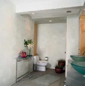
The toilet nook doesn’t scream for attention. It doesn’t need to. By tucking the fixture into its own private alcove, the space gains immediate privacy without feeling cramped or hidden away in a dark corner. The result is a layout that feels clean. Open. And remarkably easy to keep tidy. You aren’t fighting against awkward angles or exposed plumbing. You’re working with a defined niche.
For homeowners in older properties, this approach feels like a natural extension of the house’s character. If your home dates back to the late 19th or early 20th century, a modern, stark bathroom can feel like a harsh interruption. It clashes. Instead, consider a Victorian-style bathroom. It’s an elegant alternative that honors the original architecture while providing the modern comforts you need.
The aesthetic relies on specific details. Think high-gloss ceramics. Brass fixtures. Deep, rich colors or crisp whites with bold trim. It’s about creating a sense of history without sacrificing functionality.
Traditional Victorian Aesthetic Essentials
When you decide to decorate a bathroom in this style, you’re making a deliberate choice to embrace ornamentation and traditional craftsmanship. This isn’t a minimalist project. It requires intention.
- Fixtures : Opt for pedestal sinks or wall-mounted basins with exposed pipework. Clawfoot tubs are the obvious choice, but double-basin vanities with marble tops also fit the era.
- Lighting : Avoid recessed LED downlights. They’re too contemporary. Choose sconces with frosted glass shades or crystal chandeliers for ambient light.
- Flooring : Black and white checkerboard tiles are iconic. If that’s too bold, consider encaustic cement tiles with subtle geometric patterns.
- Walls : Wainscoting is non-negotiable. Cover the lower half of the walls with beadboard or painted paneling. Above, use wallpaper with intricate floral or damask patterns.
This style works best in spaces with high ceilings. If you have them, lean into them. Crown molding, picture rails, and tall windows enhance the grandeur. If your ceilings are lower, you can still achieve the look by focusing on the lower half of the walls and keeping the upper portion simple with a bold paint color.
Why Choose This Look?
It’s not just about nostalgia. A Victorian-style bathroom offers durability and timeless appeal. The materials—tile, stone, wood—age gracefully. They don’t go out of fashion every five years. For homeowners who value character over trends, this style provides a sanctuary that feels distinct from the rest of the house. It’s a retreat.
The privacy of the separate toilet niche becomes even more valuable here. Victorian homes often have quirky floor plans. Zoning the bathroom into distinct areas helps manage the flow and keeps the space functional despite its ornate appearance.
Practical Considerations for DIYers
If you’re planning to tackle this yourself, start small. Paint the wainscoting. Replace hardware. Introduce one or two statement pieces, like a vintage mirror or a brass towel rack. You don’t need to redo the entire bathroom at once.
Be mindful of water damage in older homes. Check for rot around the tub and floor before installing new fixtures. Victorian homes often have old plumbing. Upgrade your pipes if they
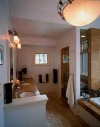
Skip the novelty bath toys. That elegant bathroom scene with bright yellow duckies is a cliché we left behind years ago. Instead, focus on fixtures and materials that honor the home’s original character.
Take an 1894 Victorian Shingle-style house. It’s old. It has history. When you revamp it from top to bottom, the goal isn’t to erase that history but to preserve it. The result is a space that feels authentic rather than manufactured.
Honoring the Structure’s Age
Consider the custom-designed stained-glass windows. They aren’t just decorative; they are period-appropriate. Pair them with light fixtures above the vanity in a new master suite addition, and the aesthetic holds together. The structure’s age is reflected in every detail.
The durable tiled floor plays a huge role here. It sets the right tone. It grounds the room. Without it, the space might feel too airy or disconnected from its roots.
Modern Comforts That Don’t Clash
A harried couple needs efficiency. Dual sinks are a non-negotiable for many. So is a separate shower enclosure. These are modern amenities. They are popular for a reason. They work for daily life.
But how do you add them without making the room look like a 2024 showroom inserted into an 1890s shell? The design handles it. Nothing appears glaringly new. The integration is quiet. It respects the timeline of the house.
Seasonal Swaps and Neutral Palettes
You don’t need to repaint to change the mood. Switch the towel colors. That’s it. A neutral palette acts as a canvas. It accommodates a large variety of color choices. It also handles bright patterns without fighting them.
Spring calls for pastels. Winter leans toward deep reds or blacks. The base remains constant. The accessories change. This approach saves money. It also saves time.
Mixing and Matching for Your Home
Whether you are remodeling the entire bathroom or just redecorating a corner, take these ideas. Don’t copy them blindly. Mix them. Match them. Create the décor that fits your life and your home.
The goal is cohesion. Not perfection. If you value the character of an older home, let the fixtures speak to that era while serving your current needs. The contrast works when it’s intentional.
“The design is so well handled, nothing appears too glaringly new.”
This balance is tricky. It requires looking at the bones of the house before picking out the finishes. If the tiles are wrong, the whole thing falls apart. If the lighting is too modern, the stained glass looks out of place. It’s a delicate equilibrium.
For more guidance, look into specific styles. Kitchen decorating ideas often bleed into bathroom trends. Dining room layouts influence vanity placement. Home office tips can help with storage solutions. Interior decorating principles apply everywhere.
Decorating kids’ rooms is different. They need durability and fun. A traditional bathroom might not suit that energy. But for a master suite, the quiet elegance works. Designing a bathroom is about flow. Decorating a bathroom is about feel.
Kids bathroom decorating ideas often prioritize washability over aesthetics. Adult spaces can afford to prioritize style. But both need function.
If you’re stuck, start with the tiles. They are the hardest

The Traditional Look
Traditional bathroom design isn’t about chasing trends. It’s about symmetry and complexity that has held up for generations. You will notice the details immediately. Pedestal sinks feature reeded columns with vertical striations. The bases often look like distinct, separate pieces with their own carved design. Toilets are typically two-piece models. Hardware leans toward ornate brass or pewter finishes rather than sleek metal. A claw-foot tub and arched Palladian windows serve as the definitive icons here.
At its best, this style radiates dignity and warmth. It can be rustic or refined. A bit of wear on the finishes doesn’t detract from the aesthetic; it adds an heirloom patina. Achieving this in a modern, compact bath requires intentional choices. You must rely on timeless materials to anchor the room. Traditional bathroom design thrives when you use ceramic tile, marble, fabric, porcelain, or even wood. These textures bring the spirit of tradition home, countering the sterility of standard modern fixtures.
American Country Style
American country style invites warmth but avoids stark contrasts. Skip the high-contrast black and white. Instead, paint walls in soft Navajo white, unbleached linen, or wheat tan. These light, warm neutrals flatter skin tones without shrinking the visual space of a small bathroom. For accents, look to antiqued tones. Old rose, barn red, denim blue, and soft green work well.
Your vanity should reflect this grounded aesthetic. Golden oak or Shaker-style maple cabinets pair nicely with plain off-white ceramic or stone-look countertops. A white porcelain sink bowl keeps the focus on the material. A pedestal sink with a traditional shape also fits the bill. Consider a washbowl that sits on top of the counter, reminiscent of antique vessels. A claw-foot tub is essential for maximum nostalgia.
Fixtures require a shift away from shiny chrome. Choose antiqued brass or brushed nickel to mimic the soft look of old pewter. If you want wood, use naturally finished golden oak for toilet seats and towel bars. Do not overdo it. Balance is key.
When selecting shower curtains, avoid chaotic patchwork patterns unless you have a large wall space. Opt for tablecloth checks, mattress ticking stripes, or subtle plaids. Plain off-white muslin with a liner is a safer, cleaner bet. Pull your color scheme into towels, bath mats, and rugs. A simple rag rug in matching tones helps tie the room together.
Windows should be dressed simply. Handkerchief-point valances work for a light touch. Add café curtains or wood shutters for more coverage. Accessories should look handmade. Choose soap dispensers that resemble hand-thrown pottery or creamware. Round bar soaps and well-ironed cotton guest towels add an old-fashioned charm that isn’t kitschy. Use wicker baskets for storage. If floor space allows, a small Shaker-style child’s chair piled with rolled towels adds a charming, functional touch.
English Country
English country style is polished, comfy, and romantic. It has been a favorite since the Victorian era. It feels more refined than its American counterpart, offering relaxed gentility with a touch of whimsy.
Start with a traditional cabinet in fine-grained wood like maple, cherry, or mahogany. Top it with white marble, real or faux. If space is tight, a pedestal sink with a reeded column and curvy backsplash is the better choice. Hardware should be brass or pewter-look, as ornate as you prefer.
The floor sets the tone. Small black-and-white ceramic tiles are classic. Add a chair rail to divide the wall. Use board-and-batten paneling below the rail. Above it, apply wallcovering with a garden motif. Roses, violets, and ivy are ideal choices.
For tubs, whether claw-foot or combo units, hang colorful cotton chintz floral curtains or crisp white cutwork. Match these with café curtains at the window. Accessories should be china with floral patterns in your chosen color scheme.
This style blooms in fresh pastels. Think tea rose, cantaloupe, robin’s egg blue, and buttercream. Pair these with lettuce or celadon green. Select a couple of these hues for your towels and accessories to maintain cohesion.
French Country
French country style remains perpetually in vogue. It offers a romantic aesthetic that feels both historic and lived-in.
To build this look, choose a traditional pedestal sink with a reeded column base and a curvy backsplash. Alternatively, opt for a wood vanity cabinet. Pecan or fruitwood are excellent choices. Look for cabinets with cathedral-topped, raised-panel doors. The hardware should be “antique” brass pulls to reinforce the vintage feel. This style relies on the texture of the wood and the elegance of the curves to create its atmosphere.
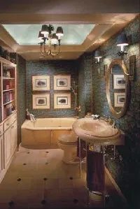
French Country Provençal
Keep the momentum going with a white porcelain sink. Pair it with fittings that curve like brass or have that soft, oxidized look of pewter. The countertop should be marble or a high-quality faux-marble to catch the light. If you’re short on square footage, a French armoire offers storage without breaking the traditional freestanding furniture aesthetic.
Terra-cotta floor tiles bring heat. They mimic the sun-baked warmth of Provence. On the walls, hand-painted tiles and murals celebrate that specific brand of French artistry. Pick a shower curtain in a cheery Provençal print. Look for blocks of yellow, royal blue, and brick red. Match a balloon shade at the window to tie the room together.
Want a romantic palette? Steal from French Impressionist and Expressionist paintings. Think vibrant yellow-green, violet-blue, and coral, sliced through with white. For accessories, stick to Provençal-inspired hand-painted pottery. Add wrought iron pieces with ornately curved lines. It’s practical beauty.
18th Century Elegance
If you want timeless elegance without the guesswork, look to the 18th century. This style borrows from American and English designs. It relies on symmetry and grace. Think Queen Anne, Sheraton, Duncan Phyfe, and Chippendale. These are the golden age of furniture. You might also see later influences like French Empire or early English Victorian creeping in.
Start with heirloom-quality maple or cherry vanities. Look for cathedral-topped, raised-panel doors. Chippendale-style brass hardware seals the deal. Prefer something lighter? Choose an 18th-century vanity in antiqued white. Painted or gilded embellishments will add character.
Top the cabinets with real or faux-marble. Drop in a pure white or hand-painted porcelain sink. Go for a traditional shape or a scallop-shell design. Pedestal sinks with similar styling work too. Add heavy brass fittings. Look for neoclassical elements like laurel leaf wreaths and scallop shells.
For walls and windows, tapestry and moiré-look coverings fit right in. Modern versions are water-tolerant, which matters in a bathroom. Muted jewel tones work well: old gold, blue-green, Federal blue, burgundy, and old rose. Or go pale and fresh. Try tea rose pink, primrose yellow, celadon green, sky blue, and white. Either way, the result is pedigreed. It’s gracious. It’s wonderfully timeless.
Italian Villa Luxury
A spacious bath feels made for Italian villa style. It draws from palatial yet airy homes of the Roman Empire through the Renaissance. It’s luxurious. It’s never heavy-handed.
You need a strong shell. Palladian windows. Arched doorways. High ceilings. These create the necessary volume. Continue with grand gestures. Use ornately carved vanity cabinets in fine-grained hardwoods. Embellish them with ornate, antiqued brass hardware.
For surfaces, think Roman baths. Italy is a top source for quarried stone and artisan tiles. Indulge in natural stone flooring, countertops, backsplashes, and walls. Do it especially in a walk-in shower area.
Polished marble is luxurious. Granite is durable and dramatic. Tumbled marble tiles add interest. Hand-painted Italian tiles can carry your color scheme. Combine them if you like. Choose a hand-painted porcelain sink. Or a full fixture suite in a regal tone: maroon, hunter green, eggplant, warm gold, or ivory.
If the budget permits, find a pedestal sink carved from agate or rose quartz. It’s a work of art. For fittings, choose ornately designed brass or pewter. Maybe add faucet handles adorned with quartz or another semiprecious stone.
Call in a faux-finishing artist. They can conjure the richly antiqued look of an ancient palazzo. Use richly dimensional plaster walls, sponged or painted with fresco scenes. Add faux-bois woodwork finishes. If you’ve always wanted a bit of opulent gilding, go for it. Commission a custom mural, too. A Tuscan countryside scene, a Roman temple ruin, or a Renaissance still life works beautifully.
Lodge and Cabin Rustic
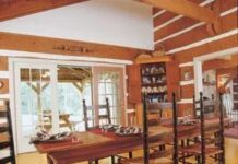
Get away from it all without leaving home. A rustic lodge or cabin bathroom does the trick. Don’t live in a log house? Hire a trompe l’oeil artist to paint “logs” on your walls. Or keep it simple. Surround yourself with earth tones: greens, browns, and tans. Accent with autumn-leaf colors like terra-cotta, brick red, and gold.
Choose a vanity in rustic wood. Oak or knotty pine works. Add a simple sink. A bronze, pewter, or white porcelain bowl sits well on a countertop of slate, tumbled marble, or another textured surface.
A claw-foot tub with an old-fashioned “sunflower” shower fixture adds charm. An unbleached muslin curtain fits the mood. A plain walk-in shower tiled in tumbled marble is equally effective. Keep window treatments simple. Stained wood shutters. Plain muslin Roman shades. Café curtains in homespun green, brick, or gold-and-white checks.
Metals should be matte. Choose antiqued bronze, brass, pewter, or brushed nickel. Avoid shiny brass, chrome, or stainless steel. Accessories should be in wood or stoneware. They need to blend with your palette.
Southwestern Heritage
Southwestern design is a bilingual blend. It mixes dramatic colonial Spanish with Native American influences. The look offers timeless warmth and heritage. It’s especially relevant for homeowners in the Southwest.
Frame the space with off-white plaster walls. Expose dark-wood beams. This sets the stage for everything else.
Material Choices for a Southwest Spa Look
Dark wood doesn’t have to mean heavy. A rustic vanity, stained deep and fitted with wrought-iron style hardware, grounds the space without overwhelming it. It feels authentic. It feels lived in. For the counter, break up the darkness with something lighter. Off-white tumbled marble offers texture and coolness. If stone is too pricey or high-maintenance, solid surfacing or a high-quality laminate works just as well. The key is contrast.
The floor is another story entirely. Terra-cotta tiles bring that warm, earthy undertone that defines the style. They feel real underfoot. And if you have a soaking tub? Frame it with colorful Spanish tiles. Think of them as a nod to cooling courtyard fountains. Instant spa vibe. No plumbing required.
Color Palettes and Decor Details
White walls and dark woods create a high-contrast canvas. How you dress it depends on the mood you want. Go neutral. Soft coral. Gray-green. These desert tones keep things calm. Or lean into the energy. Serape-inspired patterns in sunny gold, turquoise, brick red, yellow, and cobalt blue add a bright, happy pulse to the room.
Don’t forget the soft furnishings. Shower curtains and window coverings should echo the chosen palette. Woven baskets add storage and texture. If your bathroom gets good natural light, put terra-cotta pots with aloe vera plants on the sill. It’s a small touch. But it brings life to the space.
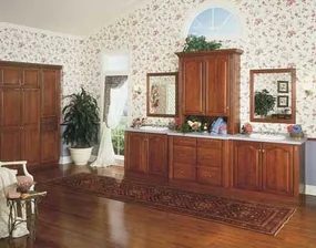
Mediterranean
The blueprint for this look comes from the sun-baked coasts of Italy, Spain, and Portugal, where stone and tile aren’t just building materials—they’re history. Southern France and Greece add their own distinct flavor to the mix. Together, these cultures offer a playbook for creating a bathroom that feels both timeless and alive, regardless of the square footage.
This isn’t about museum pieces. Mediterranean design respects history but isn’t bound by it. It’s hearty. Practical. It treats the small rituals of daily life as art.
To start, pick a vanity cabinet in oak or pine. If you want to splurge, look for fruitwood or pecan. The hardware needs to feel heavy and real—antiqued brass is the standard. It tarnishes properly. It ages.
For the sink, hammered brass offers texture. Porcelain works too, especially if it features hand-painted motifs inspired by the region. The countertop is where the durability meets the beauty. You need ceramic tile. Italy, Spain, and Portugal make the world’s best. Use them.
Choose a color palette. The classic trio is royal blue, sun yellow, and white. Treat the vanity backsplash and the top surface like a canvas. Lay out the decorative tiles to create a pattern that feels intentional, not random.
Walls? Go heavy. Textured plaster or stucco gives the room body. Break up the monotony by inset a single jewel-toned ceramic tile here and there. It draws the eye. It stops the wall from feeling flat.
Accessories should feel earned. Hand-painted pottery for soap dishes. Heavy glassware with blue and green tints for toothbrushes. If the window gets serious sun, plant lavender or rosemary. It smells like the region. Finish with a Roman shade in sail-white to soften the light.
Traditional styles fracture by genre and era. The next step takes us back to the roaring twenties.
To dig deeper into these aesthetics and find more tips for every room, check out:
- Kitchen Decorating Ideas
- Dining Room Decorating Ideas
- Decorating Ideas
- Home Office Decorating Ideas
- Decorate Home Spaces Ideas
- Interior Decorating
- Home Decorating Tips
- Decorating Kids Rooms
- Decorating Styles
- Bathroom Décor
- Bathroom Decorating Ideas
- Designing a Bathroom
- Decorating a Bathroom
- Kids Bathroom Decorating Ideas
Master Bath Decorating
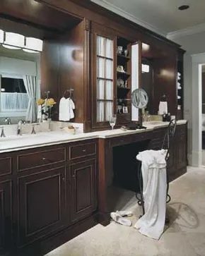
Aging-in-Place Features in a 1920s Master Bath
The original structure dates back to 1922, but the new master suite feels like a modern sanctuary. It is luxurious without shouting for attention. Quality materials meet smart design here. The result is a space that is as functional as it is beautiful.
Safety was non-negotiable for this renovation. The homeowners prioritized accessibility from day one.
Grab Bars and Entry
Grab bars are installed on both sides of the tub. They are securely anchored. The tub deck remains clear of fixtures. This design choice allows for easy, seated entry. No awkward reaching. No tripping hazards.
Shower Safety and Flooring
The shower floor uses textured, nonskid ceramic tile. It is not just for style. It prevents slips. A built-in solid-surfacing bench sits inside the shower. It offers a place to sit while bathing. This is essential for those who cannot stand for long periods.
These details do more than look good. They ensure the bathroom remains usable for decades to come.
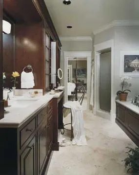
The cabinets are the anchor here. Custom cherry wood brings warmth, but it’s the beaded detailing on the door and drawer fronts that stops it from feeling heavy. It’s elegant. Not showy. Just right.
Upper cabinets use glass-mullioned doors. Pure white sheers hang behind the glass. This keeps personal clutter out of sight while letting light through. The result is airy. Vintage. It softens the dark wood grain significantly.
Open shelving balances the closed storage. This is where you display silver miniatures and favorite photos. It’s also practical. Towels are within reach, not hidden away.
Cherry tones naturally evoke history and comfort. But this space leans elsewhere. The decorating style is distinctly Southwestern. It feels like a vacation. Without the packing.
How do you pull off that desert resort look in an everyday home? It starts with the palette and the textures. You need to mix the rich, reddish hues of the cherry with earthy tones typical of the Southwest. Think terracotta, sand, and deep blues.
The sheers are a key tactical move. They diffuse light, making the room feel larger and less formal. Dark wood can feel oppressive if it’s too stark. The fabric breaks up the visual weight.
For the open shelves, keep the items meaningful. Silver miniatures add a touch of sparkle that contrasts with the matte wood. Photos add a personal layer. The towels are the functional element. You’re showing off your lifestyle, not just your storage capacity.
This blend of traditional craftsmanship and relaxed, vacation-inspired decor creates a specific mood. It’s inviting. It’s lived-in. But it’s still polished.
If you’re trying to replicate this, start with the cabinet style. The beadboard detail is essential for that semi-traditional look. Then, introduce the glass and fabric layer. Finally, curate the open display carefully. Too much clutter ruins the airy effect. Too little looks sterile.
The Southwest style doesn’t mean buying cactus prints and cheap pottery. It’s about the feel. The warmth. The connection to the landscape, even if you’re in a city apartment.
Next, we’ll look at how to expand this vibe beyond the kitchen. The same principles apply to the rest of the house. You want that consistent sense of escape.
Expanding the Aesthetic
The key is consistency. If the kitchen feels like a lodge, the living room shouldn’t feel like an office. Use similar wood tones. Repeat the earthy color palette. The goal is a cohesive flow.
You don’t need to renovate everything. Start with accessories. Rugs with Southwestern patterns. Throw pillows in rust or teal. These small changes shift the mood without the cost of a full remodel.
Lighting matters too. Warm bulbs enhance the cherry wood. Cool white light can make the space feel clinical, breaking the vacation illusion.
The balance is delicate. Too much rustic, and it feels dated. Too modern, and it loses the charm. The cherry cabinets provide the structure. The decor provides the soul.
It’s a specific look. Not for everyone. But for those who want their home to feel like a retreat, it works. The question is whether you’re willing to commit to the aesthetic consistently. Or if you’ll stop halfway, leaving
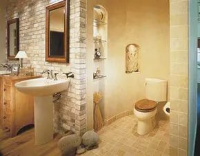
Rustic bathrooms often get a bad rap for feeling dated, but these spaces prove otherwise. When done right, the style isn’t about clinging to the past. It’s about material honesty. Think weathered wood. Rough-hewn stone. These aren’t just decor choices. They are structural truths.
In vacation homes with panoramic views, the bathroom becomes a sanctuary. The design here leans into sculptural forms. It feels timeless because it avoids trends. The mood is contemporary, not because of sleek chrome, but because of simplicity. Texture replaces artifice. The result is free-spirited yet grounded.
The Power of Natural Elements
Take the first room. It doesn’t try to be fancy. It relies on a trio of materials working in concert. Weathered wood provides warmth. Rough-cut stone adds weight. Strategically placed beams introduce rhythm.
This combination creates a striking effect without clutter. The eye moves across the textures. It doesn’t get stuck on one shiny object. Instead, the architecture itself becomes the art. And if you have a view? Let it steal the show.
In this setup, the window isn’t an afterthought. It’s the focal point. The rustic materials frame the landscape. They don’t compete with it. They support it.
Playful Architecture Meets Exposed Brick
The second bathroom takes a different route. Here, the architecture is rounded. Soft curves contrast with the harshness of exposed brick. It’s playful, almost whimsical.
Niches are carved into the walls. They offer a classical reference point without being overt. You place a simple vase in one. A candle in another. The niche becomes a display case, but subtly. It breaks up the mass of the brick. It adds depth.
This mix of rustic elements and playful design choices prevents the space from feeling heavy. It feels fresh. It feels lived-in. Not staged.
Whimsy and Comfort in Rustic Style
You might think rustic means uncomfortable. Hard surfaces. Cold stone. These rooms refute that idea. Comfort is built into the layout. Freestanding furniture adds to the relaxed vibe.
Accent pieces are whimsical. Maybe a mismatched stool. A vintage mirror with a worn frame. These details soften the rough edges of the material palette. The look is rich but unassuming. It doesn’t shout. It invites you to stay.
How do you achieve this on a budget? You start with what you have. Salvaged wood. Reclaimed stone. Don’t buy new to look old. Buy old to look true. The sophistication comes from curation, not cost.
If the rural, earthy vibe of the southwest isn’t your thing, don’t worry. There’s a path to a romantic, period-specific bathroom that doesn’t break the bank. We’ll look at how to pull that off next, but for now, appreciate the power of simple, honest materials.
To get more decorating ideas as well as tips and information on decorating your home, visit:
-
Kitchen Decorating Ideas
-
Dining Room Decorating Ideas
-
Decorating Ideas
-
Home Office Decorating Ideas
-
Decorate Home Spaces Ideas
-
Interior Decorating
-
Home Decorating Tips
-
Decorating Kids Rooms
-
Decorating Styles
-
Bathroom Décor
-
Bathroom Decorating Ideas
-
Designing a Bathroom
–
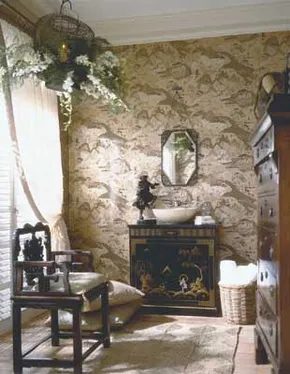
Small spaces don’t mean small ambitions. A powder room is the ideal playground for historical pastiche or exotic escapism, and the best part? You rarely need a fortune to pull it off. The constraint of square footage actually works in your favor here. It forces you to be deliberate.
Consider the gold-and-cobalt-blue powder room that mimics a 19th-century library. It’s not about having a real library; it’s about the feel. The window treatments are lined fabric chosen specifically for its resemblance to Italian endpapers. That’s the kind of detail that sells the fantasy without requiring you to buy antique books. Add a strongbox-style side table. Install a library ladder, even if it’s just decorative or only reaches a low shelf. These props anchor the theme.
Then there’s the ivory-and-taupe option. This palette evokes the quiet, restrained elegance of ancient Chinese aristocracy. The trick isn’t just the paint color. It’s the materials. You need finishes that feel substantial and period-appropriate. If you go for a specific era or locale, research is non-negotiable. Don’t guess on the color scheme. Don’t assume what “ancient China” looks like based on a movie. Look for authentic material palettes.
Once the shell is set, accessories take over. But here’s the trap: overdoing it. Choose pieces that reinforce the style, then stop. Use just enough to make the statement. Your guests aren’t there for an interior design lecture. They want a clean sink, good lighting, and a space that doesn’t feel cluttered. Function and scrupulous cleanliness are the baseline. The theme is the cherry on top.
French Provincial Details
Romantic themes often bleed into French Provincial decor. It’s softer than the starkness of modernism, warmer than traditional European grandeur. It asks for specific details to work. You can’t just slap a cream color on the walls and call it done. The moldings matter. The hardware matters. The texture of the fabrics matters.
Researching Authentic Materials
If you’re tackling a French Provincial look, start by identifying the key structural elements. Traditional homes from this style often feature:
- Wainscoting or paneling : Even in small powder rooms, a half-wall of paneled wood can ground the space.
- Brass or bronze fixtures : Avoid shiny chrome. Look for aged finishes that suggest history.
- Floral or toile fabrics : Used sparingly on curtains or a vanity stool, these add the necessary romantic touch.
You don’t need original antiques. High-quality reproductions can mimic the patina of age if you know what to look for. Check for wood grain consistency. Look for joins that are hand-cut, not machine-perfect.
Sourcing and Safety
When sourcing materials for these themed projects, remember that moisture resistance is key. Even in a powder room, humidity fluctuates. If you’re using fabric-lined treatments, ensure they’re treated for mold resistance. Wood furniture should be sealed properly to handle the occasional splash.
Safety isn’t just about slip hazards. It’s also about structural integrity. If you’re adding a library ladder or heavy shelving to support a theme, anchor it to the studs. Drywall anchors alone won’t hold a heavy strongbox
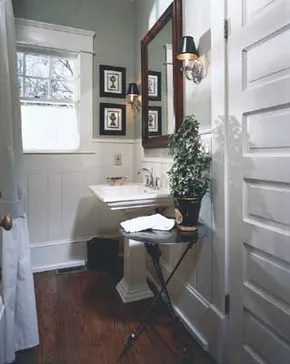
The French influence in these bathrooms is impossible to miss. They are refined, sure, but not stiff. There is an élan here. A quintessentially chic spirit drives the design. One room feels like it’s channeling Cinderella or perhaps Marie Antoinette. It has a coquettish air that feels playful yet polished.
The other is different. It is a restrained homage to the Napoleonic Empire period. Black accents do the heavy lifting here. They create excitement without sacrificing elegance. You know the old designer’s dictum: every room benefits from a bit of shiny black. These two baths put that rule to good use.
Faux accents are where the magic happens. Look at the painted drapery rod and the swathe over the door. They complement the faux drapery on the vanity mirror. It is theatrical. It is deliberate. But what keeps this look from slipping into cliché?
It is the color.
The schemes are sophisticated. They are largely neutral. You will see white, cream, tan, brown, and black. That is the core palette. Then, there is a wash of sage green in one room. A hint of old rose in the other. These subtle touches keep the eye moving. They prevent the space from feeling flat or costume-like.
French Provincial borrows heavily from specific historical styles. It is rooted in the past. But contemporary designs take a different path. They feature a variety of themes. They are influenced by modern times. If you want to move away from the historical references and into current trends, the next section covers contemporary bathroom decorating.
To get more decorating ideas as well as tips and information on decorating your home, visit:
-
Kitchen Decorating Ideas
-
Dining Room Decorating Ideas
-
Decorating Ideas
-
Home Office Decorating Ideas
-
Decorate Home Spaces Ideas
-
Interior Decorating
-
Home Decorating Tips
-
Decorating Kids Rooms
-
Decorating Styles
-
Bathroom Décor
-
Bathroom Decorating Ideas
-
Designing a Bathroom
-
Decorating a Bathroom
-
Kids Bathroom Decorating Ideas
Contemporary Bathrooms
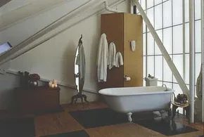
The Reality of Contemporary Design
Forget the textbooks. “Modern” design actually traces its roots to the Arts and Crafts movement, a revolt against Victorian fussiness that started in the early 20th century. But if you ask a designer today what “modern” means, they’ll point to icons from the 1930s through the ’60s.
Then there is contemporary style. It’s not a rigid rulebook. It’s a vibe. Clean. Cool. Adaptable. It can be dressed up or thrown on like sweatpants. Since bathrooms are already packed with sleek fixtures, choosing this look is often the path of least resistance.
What does it actually look like?
– Simplicity is king. Curves are loose, almost sculptural.
– Angles are sharp. Squared-off lines are common.
– Details are stripped. Surface decoration is minimized.
– Texture replaces pattern. Interest comes from how things feel, not what they depict.
You will see sculptural one-piece toilets. Sleek built-ins. Minimal hardware. Lots of chrome. Some brands even flaunt their mechanics. Traditional styles hide the pipes; contemporary styles show off the engineering. Other products strip forms down to their absolute essence. Think abstract dolphin patterns in fabric rather than realistic ones. It works in any bathroom because it shares the same DNA as the fixtures themselves. The result? Freshness. Freedom.
Creating a California Spa Look
This is the most popular offshoot of contemporary design. It lives comfortably in transitional spaces. It is softer than stark modern. Cleaner than ornate traditional. If you want a home renovation that feels like a resort, this is where to start.
Michael Taylor, the late design legend, is often credited with defining this aesthetic. It uses neutrals drawn from nature: baskets, sea sponges, driftwood. The color palette? Every shade of white. From warm ivory to cool oyster-shell gray.
Want a pop of color? Look for soft pastels that mimic sea glass.
– Celadon (pale gray-green)
– Lettuce (light yellow-green)
– Periwinkle (pastel blue-violet)
Material choices matter here. You’ll want over-scaled, sleek white porcelain spa tubs. Pedestal sinks. Drop-in sinks set into bleached-wood vanity cabinets.
Cabinets should be clean. Frameless. Hardware-free. Or, if you must have knobs, choose silvery brushed-nickel. Or get weird. Pewter starfish hardware is on brand.
Floors need to be pale, beautiful, and durable. Real or faux white marble. Oversize white ceramic tiles laid on the diagonal to make the room look bigger. Accessories? Fluffy towels in white, sand, or ecru. A few large shells to hold soap. That’s it.
Scandinavian Contemporary Vibes
This isn’t the serious Scandinavian modern of the 1950s. It’s the cheerful cousin. It pairs whites and light wood tones with one or more bright primary colors. It is a guaranteed hit for a kid’s bathroom or a space with a sailing theme.
Vanity options:
– Painted glossy white.
– Naturally finished pale wood, like ash or beech.
Sink choices should be simple. A white porcelain drop-in sink. Add a gooseneck faucet. Use fittings in colorful enameled steel for a jolt of fun.
If primary colors aren’t your thing, try intense secondary and tertiary colors. Teal. Violet. Yellow-orange. Lime.
For long-term versatility, keep strong colors on textiles. Towels. Accessories. If you are installing tile borders, stick to staid colors. Royal blue and teal work with almost everything else in the room.
Adding Art Deco Drama
Art Deco is glamorous. It comes from the 1920s and ’30s. It fits perfectly in a contemporary bath if you need extra cool and drama.
The palette is strict. White. Ivory. Gray. Black. Cool metallic tones. It is sophisticated. It is sleek. It demands attention.
Want to push the palette further? Lean into Miami with tropical aqua and coral. Or channel a New York-to-Paris vibe with ice blue and mauve. The Art Deco aesthetic thrives on these bold, specific choices.
The Art Deco Aesthetic
Nature isn’t just background noise here; it’s the star. Stylized leaping antelopes, lotus flowers, and palmetto leaves define the ceramic tile borders and wall coverings. This is how you bring the exotic into a domestic space.
Fixture selection dictates the tone. Traditional white pedestal sinks evoke the Grand Hotel era. Pair them with gleaming chrome fittings. Mirrors are non-negotiable. They expand the space and reflect the light.
Accessories should feel cold to the touch. Look for silvery mercury glass. Frosted glass works just as well. If you prefer a vanity, seek out blonde wood. Chrome banding and hardware are essential. Can’t find a period piece? Convert a vintage “moderne” chest of drawers. It’s a DIY project with high style payoff.
For the countertop, pale marble is the natural choice. Solid-surfacing materials work too. Even laminate can pull it off if chosen carefully. Since Art Deco is a historical style, it fits surprisingly well in traditional homes. If you own a pre-WWII house, check your existing tile. You might already have the bones of this look in place.
The Urban Loft Look
This style borrows its sophistication from Milan but keeps its soul gritty. Industrial chic meets modern minimalism. Simple shapes in remarkable materials create the visual interest.
Polished granite, art glass, and stainless steel catch the light. They add sparkle without clutter. A streamlined pedestal sink fits the bill. Alternatively, choose a vanity with an interesting sink. Hammered stainless steel bowls sit entirely on top of the counter. Art-glass bowls offer a sculptural alternative.
Cabinetry needs to be frameless. Solid hardwood or metal models work best. Finger grooves are a subtle, modern touch. If you want door and drawer pulls, make them statement-making. For a funkier 1950s vibe, chrome banding and edges help. Skip the grooved designs though. They are impossible to clean.
Countertops should be smooth. Marble or granite offers a sleek sweep. Black granite with mica chips is particularly striking. Plain solid surfacing in gunmetal gray is another strong option. If budget constraints dictate laminate, go very plain. Or choose a funky, abstract pattern. Show off the metal. Chrome and stainless steel should be visible, not hidden.
Flooring requires durability. Specify nonslip ceramic tiles. Natural stone is a good alternative. Commercial rubber tiles are practical for high-traffic areas.
Window treatments must be minimal. Narrow metal mini-blinds are ideal. A Roman shade in cotton duck works if you want a softer touch. Wall tiles should be glossy ceramic. High-gloss paint in white is the standard. If space allows, inset a dramatic color in the backsplash.
Repeat that dramatic color as an accent. Add acid green, teal, or violet-blue. Lush cantaloupe or scarlet work too. Carry these colors into accessories. Spark them with chrome and black.
Retro Modern Vibes
Retro modern is fun. It is funky. It is confident. This style celebrates the bright, brash look of the 1940s and ’50s. It is practical, too. Glossy surfaces are easy to clean. The look is young, cheerful, and energetic. It suits a kid’s bath or a space off the family rec room.
Start with a basic white bath. Toss in bright primary colors. Hot pastels work too. Try red, turquoise, and yellow. Or coral, mint, and royal blue. Mix in a pinch of black for drama.
The classic retro sink is a white pedestal. If you need storage, try a wood vanity painted in high-gloss white. For the adventurous, metal cabinets finished with appliance-grade paint are a bold move. Accent with shiny modern chrome fittings. Scour flea markets and architectural salvage dealers. Look for chrome counter edging. Vintage modern cabinet hardware is gold dust.
Flooring should be retro-patterned vinyl or linoleum. Laminate countertops fit the era. Finish with perky café curtains or a valance in retro-print fabrics. You can buy new ones or hunt for them in flea markets. Pair them with metal Venetian blinds. Use a matching shower curtain.
Accessories should be practical memorabilia. Cartoon character mugs as toothbrush holders are perfect. Shift the colors slightly to flash forward to the early ’60s. Swap mint for lime. Change the fabric and laminate patterns. The style is flexible.
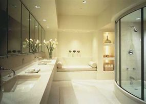
If you fancy contemporary styling but with a high-end touch, continue to the next page to learn how to create the ultimate glamor bathroom.
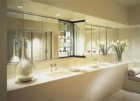
Using Scale and Tone to Expand Small Bathrooms
You don’t need a sprawling footprint to get that high-end, modern look. The key lies in smart design choices that manipulate perception rather than physical space. Take a cue from luxury bathrooms by applying the same principles to smaller rooms. The goal is to make the area feel larger, brighter, and more cohesive without breaking the bank.
Stick to Light, Unified Tones
Color consistency is your strongest tool for visual expansion. Paint the walls, install the vanity, and lay the flooring in matching light tones. Smooth textures help too—they reflect light rather than absorbing it. Even in a tight footprint, this monochromatic approach creates an airy feel.
If natural stone is out of reach, laminate is a practical alternative. Look for pale, creamy varieties. They mimic the look of expensive materials without the cost. The result is a clean, modern aesthetic that works well in compact spaces.
Maximize Reflection with Mirrors
Glass and reflection multiply the sense of space. Frameless mirrors are a proven choice for adding brightness. They eliminate visual clutter and make the room feel open.
Consider installing mirrored medicine cabinets. They serve a dual purpose: providing essential storage while reflecting light and creating depth. This is a small detail that pays off significantly in a tiny bathroom.
Budget-Friendly Material Swaps
Marble and solid-surfacing materials are beautiful but expensive. Laminates offer a stylish, affordable substitute. Choose options in light, creamy shades to maintain the airy vibe. The texture should be smooth to enhance light reflection. This approach keeps costs down while delivering a high-end look.
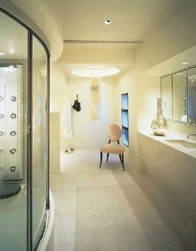
Mirrored Cabinets: How to Open Up Small Spaces with a Triptych Setup
You probably don’t have the square footage for a full wall of storage units. That doesn’t mean you’re stuck with a cramped, dark closet feel. Try installing a triptych — a three-section mirrored cabinet — on one wall. Then, place the exact same model on the opposite or an adjacent wall.
The effect isn’t just about storage. It’s about geometry.
Mirrors bounce light. They create depth. When you pair two identical units across from each other, you create a visual echo that tricks the eye into seeing double the space. The room doesn’t actually get bigger. But it feels significantly less boxed in.
“See how the space opens up” isn’t just marketing fluff. It’s basic optics.
This approach works especially well in entryways, small bathrooms, or narrow hallways. You’re using vertical space without sacrificing floor area. The symmetry is pleasing to the brain. It feels orderly. Clean.
If you’re DIY-ing this, keep a few things in mind. Mounting a three-section unit is heavier than a single mirror. Use studs. Reinforce the drywall if needed. The weight distribution matters. A falling cabinet is not the aesthetic you’re going for.
Check the mounting hardware. Most triptych mirrors come with Z-bars or keyhole slots. Match your anchors to the load. For drywall alone, you need heavy-duty toggle bolts. For studs, standard wood screws work.
Placement is key. Eye level is usually best. Center the mirror so your reflection isn’t cut off at the top or bottom. This creates a balanced look. It also ensures the light reflection hits the center of the room, not just a corner.
Why does this matter? Because small spaces feel smaller when they’re cluttered or dim. A triptych cabinet solves both. It hides clutter behind mirrored doors. It amplifies whatever light source is already in the room.
You don’t need a contractor for this. Just a level, a drill, and a willingness to measure twice. The result is a space that breathes.
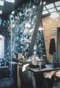
Forget the soft, rounded lines that dominate traditional glamour bathrooms. You can achieve a striking, modern aesthetic by leaning into the raw, jagged edges of quartzite tiles. It’s a sharp contrast to the usual smooth surfaces, offering a contemporary look that relies on texture rather than just color. The secret isn’t in complex installations or expensive materials. It’s in the simplicity of using just a few strategically placed tiles to anchor the space.
When you choose quartzite with its natural, fractured edges, you introduce an element of unpredictability. This isn’t about uniformity. It’s about capturing the stone’s inherent character. The jagged profiles catch light differently than polished squares, creating depth and visual interest without overwhelming the senses.
Why jagged edges work in modern spaces
You might wonder why rough, uneven edges fit into a sleek, contemporary design. The answer lies in the tension between order and chaos. A modern bathroom often relies on clean lines and minimalism. Introducing a material with organic, irregular borders creates a focal point that feels intentional yet spontaneous. It breaks the monotony of standard grout lines and uniform shapes.
This approach allows you to use the stone as a sculptural element. The jagged edges draw the eye, turning a simple tiled wall or floor into a dynamic feature. It’s a low-effort way to add high-impact design. You don’t need a full mosaic or intricate pattern. A few tiles, placed with purpose, can define the room’s character.
How to implement the look
Start by selecting quartzite tiles that retain their natural, chiseled edges. Avoid those that have been tumbled or smoothed. The goal is to highlight the raw material. When installing, consider using these tiles as a border or an accent strip rather than covering the entire surface. This keeps the design focused and prevents visual clutter.
Pay attention to the grout color. A contrasting grout can emphasize the jagged lines, making them stand out. A matching grout might blend the edges, creating a more unified, albeit less dramatic, look. Experiment with both to see what fits your space.
Materials and tools you’ll need
- Quartzite tiles with natural, jagged edges
- Thin-set mortar suitable for stone
- Grout in a color that complements or contrasts with the stone
- Tile cutter or wet saw for trimming if necessary
- Spacers to maintain consistent gaps
- Rubber mallet for setting tiles firmly
Safety and installation tips
Working with natural stone requires care. The jagged edges can be sharp. Wear gloves when handling the tiles to protect your hands. Use eye protection when cutting or grinding the stone. Quartzite is durable, but it can still chip if mishandled.
Ensure your substrate is flat and clean before applying mortar. An uneven base will show through the irregular edges of the tiles. Use a notched trowel to apply the mortar evenly, allowing for proper adhesion. Press each tile firmly into place, checking for alignment and level as you go.
Why this approach saves time and money
You don’t need a full renovation to achieve this look. Adding a few accent tiles is a quick update. It avoids the cost and disruption of replacing all fixtures or flooring. The simplicity of the design means less labor
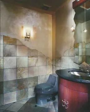
The Branching Veins of Brazilian Quartzite
It starts with a paradox. You have a tight, 36-square-foot powder room that needs to breathe. The solution isn’t more white paint or bigger mirrors. It’s stone. Specifically, a dramatic, otherworldly contemporary slab from Brazil.
The trick is the material. Branched quartzite.
This isn’t just granite with a fancy name. It is metamorphic sandstone. Water and minerals have been seeping through the stone’s capillaries for millions of years. That slow, geological plumbing job created dendrites. Branch-like veins.
Why This Stone Works in Small Spaces
Standard tile grids can box in a small room. They create a cage. Here, the quartzite is installed randomly. No pattern. No repeating lines to trap the eye.
The branching veins pull your gaze upward and outward. They mimic nature. And nature doesn’t feel confined.
“To keep the room visually spacious, branched quartzite from Brazil was randomly placed as the flooring and as the wall accent.”
How the Installation Differs
Most homeowners expect symmetry. This layout relies on chaos.
- Flooring: Large slabs cut and laid with irregular spacing.
- Wall Accent: The same stone, continuing the vein direction or breaking it entirely.
The randomness prevents the “tile grid” effect. It makes the 36 feet feel like 60.
What You Need to Know Before You Buy
If you’re hunting for this specific look, don’t just ask for quartzite. The “branched” descriptor matters.
- Source: Brazil. The geology there produces these distinct capillary veins.
- Type: Metamorphic sandstone. It’s harder than marble but softer than some granites.
- Finish: Usually polished to highlight the dendrites, but honed works if you want to reduce glare in a small, windowless room.
The DIY Reality Check
You can’t cut this yourself. The veins are unpredictable. A mistake doesn’t just ruin a tile. It ruins the flow.
- Tool: Diamond blade saw. Industrial grade.
- Safety: Silica dust. N95 mask. Eye protection. Not optional.
The stone brings the drama. The random layout brings the space. The rest is just execution.
You walk in. The floor feels solid. The walls look like they’re growing out of the earth. It’s loud. It’s quiet. It works.
Or it doesn’t. If you pick the wrong slab, the branches become a mess. A tangle. Not a design. Just noise.
Have you ever installed natural stone in a space under 40 square feet? The margin for error is tiny. The payoff is huge.
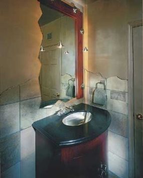
Unifying the Space with Black Granite
The floor isn’t an afterthought. It’s a deliberate anchor. Black granite tiles were laid across the entire surface, chosen specifically to echo the vanity countertop. This repetition creates a visual thread, binding the room’s disparate elements into a single, cohesive statement. Without it, the space would feel fragmented. With it, there’s a grounded weight to the design.
Texture is where the real drama lives. The wall stone wasn’t left pristine. Its edges were randomly chiseled, breaking up flat planes and introducing a tactile roughness. The mirror frame received the same treatment. This isn’t about precision; it’s about chaos contained. The jagged edges catch light differently than polished surfaces, creating a sense of movement that shifts as you walk by. It stops the room from feeling static.
Then there’s the metallic finish on the walls. A mix of tones was applied here, not just one. It’s subtle. It doesn’t shout. Instead, it offers a gleaming luster that changes with the time of day. Direct sunlight hits it hard. Shadowy corners soften the reflection. The goal was drama, but controlled drama. Not a spotlight, but a glow.
“The repetition of materials creates cohesion, while textural variation prevents monotony.”
If you’re planning this yourself, be careful with the chiseling. It’s irreversible. Test your technique on a scrap piece first. You want randomness, not accidents. The metallic paint requires even more care. One streak shows up immediately. Use a high-quality brush, not a roller, for that fine, lustrous finish. The difference between a professional look and a DIY mess is often in the brushwork.
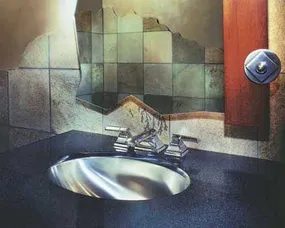
Silver beads hang low, catching the light like expensive jewelry against the glass. They mirror the shine of the stainless-steel sink below. This tiny bathroom proves that square footage doesn’t dictate style. You just need a strong concept.
Color matters. It defines the space as much as the walls or the curves. Get the palette right. Make the room pop.
Using Color to Expand Small Spaces
A neutral bathroom can feel sterile. Or cramped. Color changes the perception of depth. It alters how light hits surfaces. It can make a closet-sized room feel airy. Or intimate.
The key is contrast. High-contrast schemes draw the eye. They create movement. Without movement, a small room feels static. Flat.
Consider the fixtures. Chrome isn’t just functional. It’s reflective. It bounces light around. In a tight space, reflection is your best friend. It adds volume without adding inches.
The Role of Metallics in Bathroom Design
Metallics are more than accents. They are structural elements of the visual equation.
- Silver and Chrome : Cool tones. They feel expansive. They pair well with blues, grays, and whites.
- Gold and Brass : Warm tones. They feel cozy. They ground a space. Use sparingly in small rooms.
- Copper : Rich and earthy. Adds depth. Can feel heavy if overused.
The sink in this example is stainless-steel. Not chrome. Not gold. Steel is neutral but substantial. It holds its own against delicate pendant lights. That balance is what prevents the room from feeling cluttered.
Why Color Choice Matters in Small Rooms
Small bathrooms have fewer walls to play with. Every square inch counts. A wrong color choice can shrink the space further. It can make it feel cave-like.
Bright colors reflect light. They open up corners. Dark colors absorb light. They can create a moody, luxurious vibe. But they require good lighting to work.
If you’re renovating a small bath, think about the finish. Matte finishes hide water spots. They also hide imperfections. Glossy finishes show everything. Including dust. And water droplets.
Practical Tips for Applying Color
- Start with the largest element. Usually the vanity or the tub. Build around that.
- Use accessories for pops of color. Towels, rugs, soap dispensers. Easy to change. Low risk.
- Consider the lighting. Warm bulbs make colors look different than daylight. Test before you commit.
- Match metals. Don’t mix silver and gold unless you have a specific design intent. It can look accidental.
The pendant lights here are silver. They tie into the sink. They create a visual loop. Your eye moves from the mirror to the lights to the sink. Back again. It’s a dance. It keeps the room feeling connected.
What About Tiles?
Tiles are the skin of the bathroom. They take up the most surface area. Choose wisely.
- Subway tiles : Classic. Reflective if glossy. Timeless.
- Hexagonal tiles : Add texture. Draw the eye.
- Large format tiles : Fewer grout lines. Cleaner look. Can make small spaces feel bigger if the color is light.
Grout
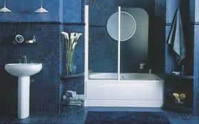
Strong color contrasts against crisp white fixtures are a safe bet for contemporary spaces. You don’t need a massive budget to make this work. Paint one or two walls in vivid shades. That alone creates a memorable statement.
Choose two wildly different colors for maximum impact. Royal blue against lime green pops. Want something subtler? Pick adjacent hues. Royal blue next to violet works. Lime green beside leaf green feels more grounded. White fixtures gleam against these strong backgrounds. They look fresh and important.
If you have extra cash, upgrade with installed materials. Tiles can create pleasing variations on your theme. Some bathrooms use solid-color mosaic. Others use a mottled mix of related tones. This adds depth within a limited color range. Silvery chrome and glass complete the look. It’s artful. It’s modern.
But tiles and fixtures aren’t the only way to play with color. What about the view outside? Subtle tones from nature can set your palette.
Letting the View Dictate the Palette
Look out your bathroom window. What do you see? Forest green? Sandy beige? Ocean blue? Let that guide your choices. You don’t need to match it exactly. Borrow the vibe.
If you have a view of trees, lean into greens and browns. It feels calming. If you’re looking at a cityscape, maybe grays and blues work better. The goal is to blur the line between inside and out.
This approach works especially well in smaller bathrooms. It makes the space feel larger. You’re not confined by four walls. You’re connected to something bigger.
Practical Tips for Natural Tones
- Test samples first. Colors change depending on light. See how they look at different times of day.
- Mix textures. Natural tones look better when varied. Matte paint next to glossy tile. Rough stone next to smooth glass.
- Keep it simple. Too many natural colors can look cluttered. Stick to two or three main shades.
Why This Works
Bringing nature indoors isn’t just a trend. It’s practical. Natural colors are easier on the eyes. They create a sense of peace. You’re less likely to get bored with them over time.
Think about the mood you want. Relaxation? Energy? Calm? Let the view outside help you decide.
The Bigger Picture
Your bathroom doesn’t have to be an isolated box. It can be part of the landscape. Even if you don’t have a window, you can still borrow from nature. Use materials that feel organic. Wood. Stone. Ceramic.
It’s not just about aesthetics. It’s about how the space feels. Does it breathe? Does it connect?
This is where design gets personal. You’re not just following rules. You’re creating an experience.
Next Steps
Want to dig deeper into natural design? Look into sustainable materials. They often have a timeless quality. Consider how light interacts with your choices. Natural light changes everything.
What’s outside your window right now?
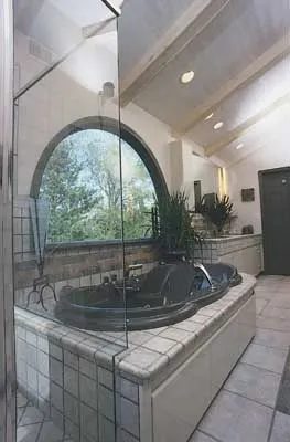
Framing the View Without the Full Reno
If your property doesn’t scream for seclusion, stop treating the bathroom like a closet. Give it the same scenic respect you grant the living room. Take a page from these homeowners who raided a neighboring bedroom and closet to expand a cramped bath. The result? A 31-by-9-foot sanctuary that actually respects the garden outside.
The view isn’t just there. It is curated. A half-round window stretches the entire length of the soaking tub. This demi-lune shape acts as a dramatic focal point. It evokes the classic curve of Palladian windows, yes. But without the stuffiness. It has dash.
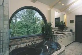
Breaking Through to the Attic
The ceiling wasn’t just painted white to trick the eye. It was physically altered. By opening the original structure into the attic space, the room gained a cathedral height. This isn’t a trick with mirrors or lighting. It’s real volume. The space breathes differently now. You can look up and see the roof line. It pulls the gaze upward, making the footprint feel wider than it actually is.
Then there’s the tile work. Not just any tile. A specific band of contrasting-color tiles runs along the backsplash of the vanity. It continues up the wall behind the tub. It defines the area clearly. The same band extends onto the floor. It creates a visual boundary. You know where the vanity ends and the open floor begins. It’s an artistic touch, sure. But it’s also structural in how you move through the room.
Which tiles work best for this?
You need something that holds up to water and foot traffic. Porcelain or ceramic. Glazed. The contrast needs to be sharp enough to catch the eye but not so loud it fights the cathedral ceiling. Matte finish on the floor tile prevents slipping. Glossy on the walls reflects the light coming from above.
How to execute the banding:
- Measure twice. The band needs to align with the vanity height and the tub edge. Use a laser level. A wobbly line kills the illusion of order.
- Cut precisely. Use a wet saw for straight cuts. The grout lines need to be consistent. Wide grout lines make the band look heavy. Thin lines look more refined.
- Seal it. If you use natural stone, seal every side before installation. If you use ceramic, you might skip this, but check the manufacturer specs. Water gets behind tiles. You don’t want rot.
The result is a room that feels larger. The verticality of the ceiling draws you in. The horizontal band of tile grounds you. It stops the eye from wandering aimlessly. It gives the space a frame. Without it, the cathedral ceiling might feel floating. Without the height, the tile band might feel cramped. Together, they balance.
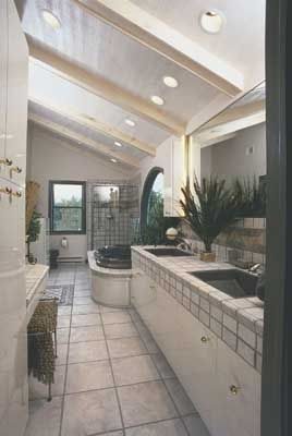
Taupe. It’s safe. It’s neutral. It’s the visual equivalent of a warm hug. But sometimes a bathroom needs to stop whispering and start speaking.
You don’t need a window view of a forest to bring the outdoors in. You just need contrast.
A band of green and copper against a taupe background does exactly that. It mimics the palette of leaves and dried stems. It’s a blithe reminder of nature, even if you’re staring at a blank wall.
But what if you have no windows? What if your bathroom is a windowless box in the middle of your house?
You can still create drama. You don’t need light from outside. You need dimensions.
Focus on curves. Sharp lines are efficient. Curves are theatrical. They define the space without walls. They draw the eye across the surface. They make a small room feel intentional rather than cramped.
This isn’t about expensive marble or imported tiles. It’s about how you arrange what you have.
If you’re looking to add more structure to your design process, start with the basics of each room’s function before layering in style.
- Kitchen Decorating Ideas
- Dining Room Decorating Ideas
- Decorating Ideas
- Home Office Decorating Ideas
- Decorate Home Spaces Ideas
- Interior Decorating
- Home Decorating Tips
- Decorating Kids Rooms
- Decorating Styles
- Bathroom Décor
- Bathroom Decorating Ideas
- Designing a Bathroom
- Decorating a Bathroom
- Kids Bathroom Decorating Ideas
Creating Drama
Drama is just geometry with an attitude.
In a bathroom, you can achieve this through tile work, lighting placement, or even the shape of the mirror. Curved vanities. Arched doorways. A round rug in a square room.
The contrast between the organic curve and the rigid tile grid creates tension. That tension is interest.
It keeps the eye moving. It prevents the space from feeling static.
You don’t need to knock down walls to change the mood. You just need to shift the focus.
A copper fixture. A green towel. A taupe wall. The triangle is complete.
The rest is just detail.
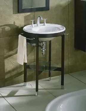
Industrial lofts didn’t invent the concept of raw, unadorned space, but they certainly popularized the idea that starkness can feel inviting rather than cold. This bathroom owner understood that distinction. They could have easily turned this generous footprint into a cluttered Renaissance museum. Instead, they chose extreme minimalism.
The result? The room feels larger, not smaller.
The Power of High-Contrast Neutrals
The design leans heavily on industrial loft aesthetics. Think exposed textures, raw materials, and a palette that refuses to apologize. High-contrast neutrals dominate the scene. Black, white, and gray interact in a way that feels deliberate, not accidental.
But the real trick here isn’t the colors. It’s the geometry.
Most shapes in this space are curved. Notice the oval black rail surrounding the freestanding tub. That’s not a mistake. It’s the showpiece. It anchors the room. If that tub were boxed in by a square frame, the entire mood would shift. It would feel rigid. Closed off. The sink vanity follows suit, avoiding sharp corners in favor of softer lines.
How Curves Soften Stark Spaces
Why does this matter?
Curved shapes introduce movement. Square corners stop the eye. Curves guide it. In a room defined by empty space and hard surfaces, softness creates balance without adding clutter.
- Oval rails break up the monotony of straight lines.
- Rounded vanities prevent the eye from hitting a hard stop.
- Smooth transitions make the space feel breathable.
This isn’t about avoiding structure. It’s about choosing structure that breathes. A square tub surround would have contained the space. The oval rail expands it.
Minimalism vs. Clutter
Many homeowners mistake minimalism for emptiness. They strip the room bare and call it done. This bath proves that minimalism requires confidence. You have to trust the negative space. You have to believe that a single, well-placed curve says more than a dozen decorative items.
The owner didn’t just remove things. They selected specific forms that complemented the scale of the room. The large footprint allowed for bold, simple choices. A smaller bath might have overwhelmed with such starkness. Here, it works.
The Industrial Loft Influence
Industrial design often borrows from warehouses and factories. Think steel, concrete, and glass. But it also borrows from the idea of function over ornament. That’s what this bathroom captures. The high-contrast neutrals echo the steel and concrete. The simple shapes reflect the no-nonsense attitude of the loft aesthetic.
Yet, it’s not cold.
The curves soften the industrial edge. They make the space livable. Inviting. The difference between a showroom and a home often comes down to these small, intentional choices.
Why This Approach Works for DIYers
You don’t need a massive budget to borrow from this logic. You don’t need custom millwork to achieve this feel. The key is restraint.
- Stick to neutrals. Black, white, gray. Keep it simple.
- Choose one or two curved elements. An oval mirror. A rounded tub. A curved vanity.
- Avoid clutter. Let the shapes
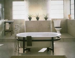
Sharp angles still have a role to play in the bathroom. Rectangular windows with modern horizontal dividers let in serious light. Some people argue that space and natural illumination are the only true luxuries you can buy. This homeowner clearly thinks so.
Other designers believe those two elements should be the entire design. Minimalism relies on that exact premise. It strips away the noise. What is left is elegance through simplicity. You stop cluttering the surface. You start appreciating the void.
Minimalism brings elegance of simplicity to design by removing everything that doesn’t serve a purpose.
How to achieve a minimalist bathroom design
Start by clearing the counters. Remove the toothbrush holders that aren’t used daily. Clear the shower caddy. Keep only what you touch every single day.
Materials matter more here.
– Countertops: Choose large slabs of stone or solid surface. Fewer seams mean less visual noise.
– Fixtures: Matte black or brushed nickel faucets. Simple shapes. No ornate curves.
– Shower doors: Frameless glass. It disappears into the wall.
– Tiles: Large format tiles on the floor. They reduce grout lines. Less grout means easier cleaning and a cleaner look.
You need good lighting to make this work. If the room feels dark, the minimalism looks like emptiness. If it’s bright, it looks intentional. The rectangular windows help. But you’ll likely need recessed LED lights. Aim them carefully. Shadows can ruin the clean lines you worked so hard to establish.
Storage is the hard part. Minimalism hides things. You need deep drawers. You need medicine cabinets that are flush with the wall. Hide the hairdryer. Hide the extra towels. If the viewer can see the clutter, the design fails.
This approach requires discipline. You can’t just throw a basket on the floor and call it “cozy.” It has to be tidy. Constantly.
Why minimalism feels luxurious
It’s not just about looking expensive. It’s about feeling calm. A cluttered bathroom stresses you out before you even step in the shower. The brain processes visual noise as stress. Remove the noise. Remove the stress.
Space feels larger when there’s less stuff in it. Light reflects off fewer surfaces. The room breathes. That’s the luxury. Not the price of the tile. The feeling of openness.
If you’re renovating, don’t underestimate the cost of custom cabinetry. It needs to be built-in. It needs to hold everything. Otherwise, you’ll end up with a sterile box that looks like a hotel room from 1990. Add texture. Maybe a wood vanity. A stone vessel sink. Something warm to balance the cold lines.
Real luxury isn’t gold fixtures. It’s the ability to breathe in your own bathroom.
Where to find inspiration
If you want to see how this looks in practice, look for bathrooms that use monochromatic palettes. Whites, grays, soft blacks. Or go for warm whites with natural wood accents. The key is consistency.
- Search for: “Frameless shower door installation”
- Search for: “Large format tile bathroom ideas”
- Search for: “Floating vanity minimal design”
These terms will lead you to projects that prioritize space and light. Avoid
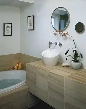
The Logic of Less in Wet Rooms
Clutter is a hazard in the bathroom. It creates tripping risks and turns routine cleaning into a tedious scavenger hunt. Strip that away and you get safety. You get serenity. Minimalism isn’t just an aesthetic choice; it’s a functional one.
Consider two bathrooms in a single California home. Same minimalist philosophy. Different executions.
The master bath leans heavily into geometry. Rectangles rule. They shape the sinks. They define the medicine cabinet. They frame the unobtrusive downlights mounted high on the wall. The repetition of clean lines forces the eye to travel smoothly across the space, rather than snagging on decorative noise.
Geometry as Structure
Why rectangles? They are honest shapes. Easy to install. Easy to maintain. In a minimalist bathroom design, the architecture itself becomes the decoration. There is no need for ornate molding or complex fixtures when the cabinetry and lighting are integrated so tightly.
The master bath uses this approach to create volume. The downlights sit high, out of the way, casting even illumination without cluttering the countertop. The medicine cabinet is flush with the wall, hiding the chaos of toiletries while maintaining a sharp, rectangular profile. It is not about removing things for the sake of emptiness. It is about removing things that do not serve a purpose.
The Powder Room Contrast
The powder room tells a different story within the same minimalist framework. If the master bath is about order and scale, the half-bath is about intimacy and restraint. Here, the lack of physical clutter is even more pronounced. There is no shower to manage. No bathtub to clean. Just a sink and a mirror.
This reduction in elements highlights the materials. The limited number of embellishments stands out dramatically because there is nothing else to compete for attention. A single, well-chosen faucet. A specific texture in the tile. These details become the focal points precisely because the surrounding space is quiet.
Practical Implications for DIY
How does this translate to your own renovation? You don’t need to demolish walls to achieve this look. Start with inventory. What do you actually use every day? Everything else can be stored or discarded.
Install fixtures that are simple to clean. Smooth surfaces. Minimal grout lines. Avoid recessed niches in showers if they require complex tiling; they often become traps for soap scum. Instead, use wall-mounted caddies or built-in shelving that aligns with the room’s geometry.
The goal is a space that feels larger than it is. Not by adding mirrors, but by subtracting visual weight. When the bathroom is stripped of its non-essentials, the remaining elements take on a new importance. The light hits the tile differently. The water flows without obstruction. You stop fighting the room and start using it.
What happens when you remove the last item on the counter? Silence. Clean lines.
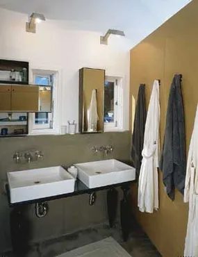
The powder room relies on a study in contrasts. Round and oval fixtures take center stage, pushing back against the rigid, rectangular geometry lurking in the background. It is a deliberate tension.
Success here demands precision. Minimalism is not an accident of poverty or laziness. It is a carefully executed plan. Every line must be intentional. Every surface must earn its place. If the layout is off, the whole aesthetic collapses.
But don’t mistake simplicity for sterility. A basic design can still bleed color. Take the green-and-white combo, for instance. It proves you don’t need a rainbow to keep things interesting. White keeps it airy. Green grounds it. The result is clean without being cold.
“Minimalist styles involve simplicity, but a basic design doesn’t have to be devoid of color.”
Why geometry matters in small bathrooms
If you are tackling a small space like a powder room, shape dictates flow. Oval vanities soften the hard edges of tiles and mirrors. They break up the visual noise of a grid-like floor plan. It is not just about looks. It is about how the eye moves through the room.
Green and white: A timeless duo
This color scheme works because it mirrors nature. Think ferns against white stucco. Or sea glass in a sand-colored shell. It feels fresh without trying too hard.
- Walls: High-gloss white paint reflects light. Makes the room feel larger.
- Accents: Sage or emerald green towels. A potted fern on the counter.
- Fixtures: Brushed nickel or matte black. Avoid chrome unless you want a retro vibe.
How to execute the look
Start with the big shapes. If your vanity is rectangular, introduce an oval mirror. If your floor is tiled in a square grid, add a round rug. The contrast creates depth.
Keep the color palette tight. White is your canvas. Green is your brushstroke. Too many shades of green will muddy the effect. Stick to one or two tones.
What you’ll need
- Paint: White, semi-gloss or high-gloss for bathrooms.
- Textiles: Towels and rugs in varying shades of green.
- Plants: Real or high-quality faux. They add life.
- Fixtures: Choose finishes that complement the green. Matte black stands out. Brushed gold adds warmth.
Safety and installation tips
- Ventilation: Paint fumes are no joke. Open windows. Use a fan.
- Electrical: If you are moving lights or mirrors, turn off the breaker. Always.
- Mounting: Hollow drywall behind the mirror or vanity needs anchors. Heavy objects fall. Don’t risk it.
The goal is a space that feels curated, not cluttered. Every item should serve a purpose or a aesthetic. If it doesn’t do both, leave it out.
The interplay of round and rectangular forms keeps the eye moving. The green adds a pulse. White keeps it breathing. It is simple. It is effective. It works.
Where to find inspiration
For more ideas on making your space work, look into specific room strategies.
- Kitchen Decorating Ideas
- Dining Room Decorating Ideas
- Decorating Ideas
- Home Office Ideas
- Decorate Home Spaces
- Interior Decorating
- Home
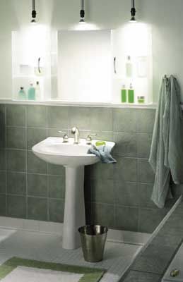
Lean Lines and Hidden Plumbing
Modern interiors thrive when they stop pretending. They embrace a design language that is unapologetically honest, technically advanced, and oddly free-spirited. You aren’t just filling a room; you are engineering a habitat. Take this bathroom. It strips away the noise.
The palette is aggressively simple. Fresh green meets stark white. It is a combination that feels youthful because it lacks the weight of tradition. A touch of metallic hardware breaks up the matte surfaces without screaming for attention. The result? Interesting without being dramatic.
Then there is the hardware. Specifically, the toilet.
Most people overlook fixtures until they break. Here, the wall-hung unit is the quiet hero. It is a European design, which means it prioritizes ergonomics over tradition. The height is adjustable. For tall users, this is not a luxury; it is a necessity. You do not want to squat or hunch over a standard 15-inch bowl.
But getting this look requires more than just buying the right porcelain.
Wall-Hung Toilet Installation Considerations
You cannot swap this out on a whim. The plumbing is buried inside the wall. This is not a weekend swap for a lazy Saturday. It demands a renovation or new construction phase. If you are doing a simple fixture replacement, stop now. You will need to tear into the drywall.
For the DIYer, or even the project manager overseeing one, here is the reality:
- The Carrier System: You need a sturdy metal frame anchored to the floor or wall studs. It bears the full weight of the user and the tank.
- In-Wall Tank: The cistern is hidden. Access panels are often required for maintenance, though some modern designs seal them off entirely.
- Height Adjustment: The carrier allows you to set the final bowl height before the tiles go up. Plan this carefully. Measure, then measure again.
- Waterproofing: With all that plumbing behind the drywall, waterproofing the area where the carrier mounts is non-negotiable. One leak ruins the wall behind the toilet.
It is a specific type of work. It requires precision. If you get the level wrong, the bowl sits crooked. If you seal it poorly, you have mold behind your vanity.
The aesthetic payoff is high. The floor space opens up. Cleaning becomes trivial. But the cost? Higher. The labor? Significant.
Is it worth the headache of hiding the mechanics? For some, the clean line is worth the risk. For others, a standard closet fixture feels safer. The choice depends on how much you value the look versus the simplicity of access.
The green and white scheme holds up regardless. It is timeless in its minimalism. But the toilet? That is a structural commitment. Make sure your framing is solid before you hang the bowl.
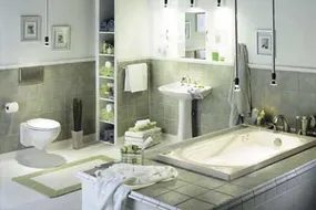
You can carry that clean, uncluttered aesthetic through the rest of the suite. The minimalist vibe doesn’t just belong in modern homes. Think about it. Bathroom fixtures are actually a very recent invention. For most of history, people used different methods entirely. So these simple, low-profile designs work surprisingly well in traditional spaces. They don’t clash. They just disappear into the background.
If you want to break away from the standard green theme, there is another option waiting. The next section showcases a bathroom that mixes yellow and green. It is vibrant. But it offers more than just color. The real story here is accessibility. This space is designed to be universal.
Accessible and Stylish
This specific design proves you don’t have to sacrifice style for function. Universal accessibility means the room works for everyone. It includes wider clearances. It avoids steps. The fixtures are positioned for easy reach. You can still have a gorgeous yellow-and-green palette while ensuring safety. This is how you future-proof your renovation.
Accessible and Stylish
Universal accessibility doesn’t mean institutional. It means thoughtful design that works for bodies of all shapes and abilities.
To find more ways to update your space, explore these specific areas:
- Kitchen Decorating Ideas
- Dining Room Decorating Ideas
- Decorating Ideas
- Home Office Decorating Ideas
- Decorate Home Spaces Ideas
- Interior Decorating
- Home Decorating Tips
- Decorating Kids Rooms
- Decorating Styles
- Bathroom Décor
- Bathroom Decorating Ideas
- Designing a Bathroom
- Decorating a Bathroom
- Kids Bathroom Decorating Ideas
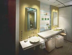
Accessible Bath Design with Vibrant Yellow and Green Accents
Color doesn’t have to mean compromise. In this bathroom, bright yellow and green prove that universal accessibility and high-style aesthetics can coexist without a single concession. The citrus tones inject a youthful, energetic vibe into the room, while the neutral cabinets and countertops ground the space with a soothing, calming presence. It’s a balance that feels both cheery and composed.
The layout is where the real innovation happens. A double vanity is fitted with counters and sinks at two distinct heights. This isn’t just a cosmetic choice; it’s a functional necessity for users of varying heights and mobility levels. To ensure there’s no obstruction for wheelchairs or walkers, the lower cabinets don’t sit fixed to the floor. They roll on heavy-duty casters, sliding out of the way when needed.
Hardware and Practical Details
The fixtures reinforce the room’s free-spirited yet practical design. Gooseneck faucets provide ample clearance for filling large containers or managing hand-washing tasks. The controls use wing handles, which are significantly easier to operate than standard knobs, especially for those with limited grip strength or dexterity.
Even the smallest details contribute to both safety and style. Satin-finish grab bars are mounted around the entire shower stall. They gleam subtly against the tiles, offering a reliable handhold without looking like sterile medical equipment. You’ll find similar bars on the front of the vanities too, doubling as secure towel racks.
“Universal accessibility can go hand-in-hand with style.”
When planning your own accessible renovation, consider how hardware and storage mobility can transform a standard bathroom into a truly inclusive space. It’s not just about adding rails. It’s about integrating support into the design so it feels intentional, not afterthought.
The result is a room that works for everyone. No one has to ask permission to use the sink. No one struggles to reach for a towel. The design simply adapts.
Is your bathroom ready to adapt? The answer might be simpler than you think.
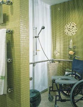
You can swap out the hues for something more traditional, or just keep it simple. These concepts work in almost any bath. Even if your space is strictly monochrome, the principles hold. A bright white bathroom doesn’t have to feel sterile. It just needs structure.
To keep your decor fresh, you might want to look elsewhere for inspiration. There are plenty of resources out there. You can check out guides on kitchen decorating ideas, dining room setups, or general interior decorating tips. If you’re tackling a home office, there’s advice there too. Kids’ rooms and general bathroom décor styles are well-documented. Whether you are designing a bathroom from scratch or just refreshing one, the options are endless.
Bright White
Making a bright white space work requires more than just picking a paint color. It’s about texture. Without color to distract the eye, you need other elements to add depth. Think about materials. Matte finishes absorb light. Glossy tiles reflect it. Mixing the two prevents the room from looking flat.
Flooring matters too. A warm wood tone breaks up the expanse of white. Or stick to large format tiles that reduce grout lines. Fewer lines mean a cleaner look. But you still need contrast. Black fixtures provide a sharp anchor. Brass adds warmth. Choose one metallic and stick with it. Mixing metals in a white room can look messy unless you’re very intentional.
Lighting is the other half of the equation. Shadows define a white space. Overhead lights alone will wash everything out. Add sconces beside the mirror. Use a dimmer switch. This lets you control the mood. Morning light is harsh. Evening light is soft. Your fixtures should handle both.
Don’t forget the small stuff. Towels. Rugs. Soap dispensers. These are your opportunities for subtle pattern. A simple geometric rug adds interest without shouting. Keep the rest of the decor minimal. Clutter kills the clean aesthetic. You need surfaces to breathe.
If you’re renovating, start with the big items. Vanity. Tub. Shower. Once those are set, you can layer in the accessories. Paint last. It’s the easiest thing to change. But changing the fixtures? That’s a job. So plan carefully.
There’s no single right way to do white. Some people go full clinical. Others go spa-like with stone and wood. Both work. The key is consistency. Pick a vibe and stick to it. Don’t add a vintage vase if the rest is modern. Don’t add chrome if you’re going for rustic. Cohesion is what makes bright white feel expensive.
And what about maintenance? White shows everything. Soap scum. Hard water stains. Hair. You’ll need a routine. Daily wiping helps. Weekly deep cleaning is non-negotiable. But that’s a small price for the brightness.
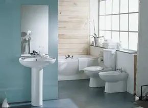
Pick a color for your bathroom suite today and you’ll likely find a white option dominating the shelves. It’s not just because it’s easy to manufacture or cheap to ship. Homeowners keep buying white toilets, tubs, and sinks even when they’re slapping bold, permanent tiles on the walls. That preference isn’t purely about cleaning ease or budget constraints. It’s an aesthetic instinct.
The old adage holds water: white goes with everything. It’s the neutral anchor in a sea of chaos. You can paint your walls a pale, serene blue and have the white fixtures look calm. Paint them a deep, aggressive burgundy? The white pops. It creates contrast without fighting for attention.
This flexibility is where the real value lies. Let’s say you commit to a permanent, high-maintenance tile color. Maybe it’s a rich emerald or a stark black. White fixtures still give you maximum leeway to shift the mood without ripping out plumbing. Swap lime green towels for black velvet ones. Suddenly, the space goes from “fresh and young” to “sharply sophisticated.” You’re not locked into one vibe. You’re just changing the accessories.
Then there’s the design angle. Whether you’re going for a traditional clawfoot or a modern wall-hung unit, the shape of the fixture matters. White hides nothing. It highlights the curves, the lines, the engineering. A colored fixture might blend into a colored wall. A white one stands out as a sculptural element. It draws the eye to the form itself.
Think of a all-white bathroom as a blank canvas. It’s waiting for you. If you decide later that you want the feeling of the great outdoors, that white background is ready to support original murals or forest scenes. The fixtures won’t clash. They’ll frame the art.
To get more decorating ideas as well as tips and information on decorating your home, visit:
-
Kitchen Decorating Ideas
-
Dining Room Decorating Ideas
-
Decorating Ideas
-
Home Office Decorating Ideas
-
Decorate Home Spaces Ideas
-
Interior Decorating
-
Home Decorating Tips
-
Decorating Kids Rooms
-
Decorating Styles
-
Bathroom Décor
-
Bathroom Decorating Ideas
-
Designing a Bathroom
-
Decorating a Bathroom
-
Kids Bathroom Decorating Ideas
High Style
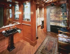
The boundary between indoors and wild outdoors gets blurry here. You step into a bathroom where the walls don’t just reflect light—they tell stories.
Original murals on canvas dominate the space. They depict forest scenes and sea views. It’s an homage to the great outdoors, but it’s not kitschy. It’s magnificent.
Stained Glass as a Functional Art Piece
Look at the mirror above the pedestal sink. To the right, there’s custom-designed stained glass. It features animals and oak leaves. The glass is back-lit. This adds drama when the lights come on.
Custom stained glass is appearing in more baths of all sizes. It serves as an artful alternative to window coverings. You don’t need a real window for light and texture. You can build your own view.
Tile Themes and Wood Matching
The shower wall tells a different part of the story. Hand-glazed putty-colored tiles cover the surface. They repeat the theme of woodland animals and oak leaves. The glaze gives them depth. They aren’t just flat ceramic squares.
Cherry wood millwork is used throughout the bath. It’s custom-designed. The wood is stained to match the floor.
The floor itself is a woodgrain vinyl. It’s installed on the diagonal. This angle breaks up the squareness of the room. It makes the space feel larger. The stain on the cherry wood matches the vinyl’s grain. This creates unity.
Why This Combo Works
You might think wood and water don’t mix. Vinyl floors handle moisture better than real hardwood. Cherry wood adds warmth. The black fixtures provide contrast. They anchor the rich colors.
Sophisticated black fixtures play starring roles. They cut through the cherry and the green tones of the stained glass. The combination feels intentional. It doesn’t feel random.
This bathroom proves you can layer textures. Canvas. Glass. Glazed tile. Vinyl. Wood. Each material brings something different. Together, they create a space that feels alive.
How do you keep it from looking cluttered? You stick to a theme. Here, it’s nature. The oak leaves appear in the glass. They appear in the tile. The murals show the forest. It’s a cohesive narrative.
Not every homeowner wants a mural. But the principle holds. Pick a motif. Repeat it. Match your wood to your floor. Use lighting to enhance the art.
The result is a room that feels curated. Not mass-produced. It has soul.
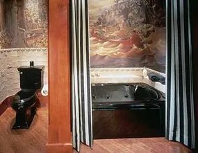
The Asian-Inspired Bathroom Look
You don’t need a hand-painted mural to get that serene, Far Eastern vibe. If custom art is blowing your budget, look locally. Art students often paint for exposure or low fees, giving you a one-of-a-kind piece for the cost of a few takeaway coffees. Historically accurate murals? You can buy them now. Wall-covering versions mimic the texture and look of traditional hand-painted scenes without the commission price tag.
But what if you want to skip the artwork entirely? You can still build a cohesive Asian theme with just one layer of lacquer. It’s surprisingly effective. A high-gloss finish on walls or cabinetry reflects light, creating that clean, minimalist aesthetic common in modern Japanese or Chinese design. It’s not just about color; it’s about the sheen.
Here’s how to approach it without breaking the bank or your back.
Choosing the Right Lacquer
Not all lacquers are created equal. You need something durable enough for a bathroom’s humidity but smooth enough to look high-end. Oil-based lacquers tend to yellow over time, which can ruin the crisp white or deep black tones associated with the style. Water-based acrylic lacquers hold their color better. Look for a “high-gloss” or “super gloss” label. Matte finishes hide imperfections but kill the vibe. You want reflection.
Prep Work Is Non-Negotiable
Lacquer is unforgiving. It shows every fingerprint, every dust mote, every bump in the drywall. If your existing walls are painted latex, you need to sand them lightly with 220-grit sandpaper. This creates a “tooth” for the new finish to grip. Wipe down with a tack cloth. Seriously. Don’t skip it. Dust in lacquer looks like cracks under bright vanity lights.
If you’re painting cabinets, remove the doors. Take them to a garage or covered patio. Hang them on sawhorses. Spray or roll on a thin coat of primer designed for gloss surfaces. Sand again. Fine dust only.
Application Techniques
Rollers are okay for walls, but they leave texture. For a true lacquer look, you need a spray gun or a high-density foam roller. Foam rollers are cheaper and easier to store. They lay down a smooth, even coat without the orange-peel texture that standard rollers leave behind.
Apply thin coats. Thick coats run. They drip. They look cheap. Three thin coats are better than one thick one. Let each coat dry completely. Read the can. Follow the manufacturer’s instructions. If it says 4 hours, wait 4 hours. Rushing this step leads to tackiness, which ruins the gloss.
Safety First
Lacquer fumes are strong. Use a respirator, not just a dust mask. A standard N95 won’t stop the vapors. You need one rated for organic vapors. Ensure the room is well-ventilated. Open windows. Run fans. If you’re painting cabinets indoors, take them out. The smell lingers for days.
Finishing Touches
Once the lacquer is dry, you might want to seal the edges or touch up any missed spots. Use a fine brush for corners. Blend it out carefully so you don’t see a line.
This single change—sw
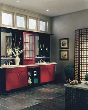
The interplay of cinnabar, black, and white creates a look that is at once dramatic and restrained. This specific color palette is not just decorative; it anchors the room’s identity. The vanity becomes the focal point, its rich red lacquer finish demanding attention while remaining grounded by the surrounding monochrome planes. It is a bold choice, but one that works because it is balanced.
Grid patterns provide the structural integrity that holds this aesthetic together. You will see this repetition of scale in three distinct layers. First, the authentic Asian shoji screen introduces a fine, delicate grid. Next, the cabinet mullions offer a medium-sized version of the same motif. Finally, the floor tiles and transom-height windows expand the grid to a large scale.
This layering of scales prevents the design from feeling flat. It adds depth without clutter. The result is a space that feels dignified and intentional.
Grids of varying sizes guide the eye and create a sense of order within a high-contrast color scheme.
To replicate this look, you need to be deliberate about material choices. The black and white elements should have strong, clean lines. Avoid ornate detailing. Let the geometry do the work. The red lacquer finish requires careful sourcing. Look for low-VOC options if you are refinishing existing cabinetry, as traditional lacquer can have a strong odor and long drying time.
Safety and ventilation are key when working with strong finishes. Ensure your workspace is well-ventilated. Use proper respiratory protection if sanding or applying new coats.
The combination of traditional motifs with modern simplicity allows for a timeless result. It is not about copying a historical period exactly. It is about capturing the essence. The grids tie the disparate elements together. The color palette sets the mood. The materials provide the texture.
Consider how light interacts with these surfaces. Natural light will soften the black and white, while the red will remain vibrant. Artificial lighting should be chosen carefully to avoid washing out the cinnabar.
This approach requires precision. Misaligned grids will look messy. Poorly matched colors will clash. But when done correctly, the effect is striking. It transforms a standard bathroom into something with character.
The question is whether you are willing to invest the time to get the details right. Many homeowners skip the grid alignment for speed. It saves time. But it also sacrifices the dignity of the space.
Is it worth the extra effort? For many, yes. The result is a room that feels curated rather than assembled.
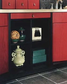
Finding Balance Through Natural Contrast
The stark, rigid geometry of the room needs a counterweight. Without it, the space feels cold. Unyielding.
Enter nature.
Chinese-inspired landscape scenes soften the hard lines. They break up the monotony of straight edges and sharp angles. But it is the vase of white orchids that truly shifts the mood.
Those exuberant sprays do more than just add color. They create a soothing balance against the austere backdrop.
Why Nature Softens Modern Geometry
Hard surfaces reflect light sharply. They can feel isolating in a small room. Organic shapes absorb that tension.
- Visual Relief: The curves of orchid stems guide the eye away from the grid-like floor or wall patterns.
- Emotional Calm: Nature imagery triggers a relaxation response. It’s a psychological break from the structured environment.
- Texture Variation: Smooth glass or metal meets the delicate, uneven petals of the flowers.
How to Achieve This Balance
You don’t need a gallery. You need intention.
- Choose High-Contrast Art: Look for traditional Chinese landscape prints or paintings. The ink wash styles work well against white or gray walls.
- Select the Right Vase: Keep the vase simple. Clear glass or matte ceramic. Let the flowers be the star.
- Pick Exuberant Blooms: Orchids, particularly white varieties, offer that “spray” effect. They rise up. They don’t stay low.
- Position Strategically: Place the arrangement where the eye lands first after scanning the geometric elements. A corner. A console table. Near a window.
“Nature doesn’t ask for permission to enter a structured space. It just softens the edges.”
The result isn’t just aesthetic. It’s functional. You can breathe easier in the room. The geometry still stands, but it feels less like a cage. More like a frame.
Is there a corner in your home that feels too sharp? Too empty? Try adding life there. Not clutter. Life.
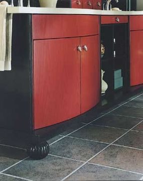
The previous approach leaned into Western modernism—a sharp, high-contrast triad of red, white, and black. It works, but it feels rigid. This iteration steps back. It reveals an Asian sensibility, trading the starkness for something richer and far more subtle. You’ll find a floor mottled in unexpected blues and greens, grounding the space with a natural, uneven texture rather than a uniform tile. Jade green accents appear sporadically, softening the look without overwhelming the senses.
But there is another route entirely. One that doesn’t rely on color theory alone but on structure. Geometric designs.
Using Patterns to Shape Space
Patterns do more than fill voids. They actively shape the visual weight of a room. A well-placed geometric motif can elongate a narrow vanity area or compress a cavernous, empty wall. It’s not just decoration; it’s optical engineering.
Consider the difference between a random floral print and a strict hexagonal lattice. The former invites chaos. The latter imposes order. In a bathroom, where cleanliness and clarity are paramount, that imposed order can make the space feel larger than it is.
Practical Application for DIYers
You don’t need to re-tile the entire floor to get this effect. Here is how you can execute a pattern-led design without hiring a contractor:
- Select Your Medium: Stick to peel-and-stick tiles if you are renting or want low-commitment experimentation. They handle the geometry for you. For permanent changes, cement tiles offer the best balance of intricate pattern and durability.
- Focus on the Focal Wall: Don’t pattern the whole room unless you have a massive footprint. Pick one wall behind the vanity or the shower niche. Use a bold geometric border here. It draws the eye and creates a defined zone.
- Match the Scale: Small patterns shrink a room. Large patterns can look cartoonish in a tight space. If your bathroom is under 40 square feet, stick to small-scale geometric repeats. If you have a master bath, go big.
“Patterns are not just visual noise; they are structural cues for the brain.”
This method of decorating requires precision. Measure twice. Cut once. If you are installing tile, ensure your grout lines align with the pattern’s natural breaks. Misalignment kills the effect instantly.
The goal here is to disrupt the monotony of plain white surfaces. A geometric accent breaks up the sightlines. It gives the eye a place to rest that isn’t a sink, a toilet, or a mirror. It adds depth.
Continue to the next page to explore specific layout configurations that maximize these geometric principles.
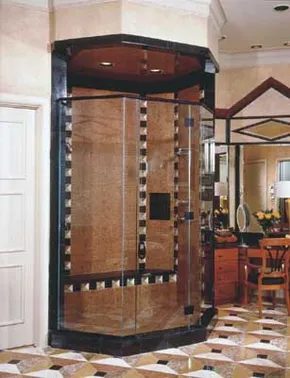
The Geometry of Calm
Large-scale geometric patterns demand a steady hand. Stripes, triangles, and sharp angles collide in this master bath. The result is an optical illusion. Flat surfaces appear to have depth. The space feels like it is moving, even though nothing is shifting.
It could easily feel chaotic. A riot of shapes usually signals disaster. But the color palette keeps things grounded. Neutrals act as the shock absorber.
Gold. Brown. Taupe-gray. White. Black.
These tones create a soothing backdrop for the aggressive geometry. The effect is energizing, not jarring. It is a balance of high energy and visual comfort.
Executing the Look
You do not need a budget to replicate this vibe. The secret is restraint. You can aim for “restrained richness” without the price tag of five different types of marble.
If you have the cash, sure. Install a dramatic vanity. Build a show-stopping shower stall. But for most homeowners, the goal is focused energy.
How do you achieve this?
- Pick one dominant pattern. Don’t mix three different complex designs. Let one pattern breathe.
- Anchor with neutrals. Use the bold pattern on one wall or the floor. Keep the rest of the surfaces quiet.
- Use texture over color. If you use stripes, try different materials for the stripes. Wood against tile. Paint against wallpaper. The contrast adds depth without adding more shapes.
The Transitional Advantage
This style works because it fits the “transitional” category. It bridges the gap between modern and traditional. Modern spaces often feel cold. Traditional spaces can feel cluttered.
Transitional bathrooms strike a middle ground. They use classic forms but update them with contemporary patterns. This makes the design timeless. It does not date quickly.
When you are planning your own bathroom, think about where the pattern should hit hardest. Is it the floor? The accent wall? The shower surround?
The key is to let the geometry do the talking. Keep the fixtures simple. Let the shapes define the style.
Do you have a pattern that feels too bold for your taste? Try breaking it up with a neutral border. It gives the eye a place to rest. It prevents the pattern from overwhelming the room.
The result is a space that feels intentional. Not random. Not safe. Just right.
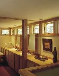
The Middle Ground: Why Transitional Works
Transitional design isn’t just a trend. It’s a bridge. It sits right between the heavy ornamentation of traditional styles and the stark minimalism of contemporary design. The result is a room that feels both curated and lived-in.
Why does this work for homeowners? Because it’s practical. You aren’t locked into a single era. You can mix a rustic, weathered wood vanity with clean, modern lines. You can pair antique-style tiles with sleek, new fixtures. The key is finding the common thread. Usually, that’s color or mood.
“Transitional styles will get you where you live!”
This approach gives you freedom. You can use tiles that echo Roman designs alongside fixtures inspired by modern ecology. It’s sophisticated but never cold. If you’re renovating a bathroom and want something that won’t feel dated in five years, this is your safest bet. It blends the old and new without creating visual noise.
Mixing Eras with Eclectic Style
Eclectic style is for those who travel or appreciate a scheme that defies labels. It’s witty. It’s dignified. It takes the best elements from various time periods and forces them to coexist.
Start with a foundation. A traditional cherry or mahogany vanity provides weight. Top it with a modern art-glass countertop sink. Add light fixtures in metal and glass to bring in the contemporary edge. Or flip it. Use a massive traditional pedestal sink but update it with contemporary faucets and mirrors. A stainless-steel counter on a Shaker-style wood vanity is another strong move.
Storage doesn’t have to be boring. In a large bath, a French country armoire or an Asian-style cabinet adds character. Materials matter here. Mix natural and ethnic-inspired options: marble, granite, tumbled marble, terra-cotta, or ethnic-patterned tiles. These materials are timeless.
What Sticks in an Eclectic Room
Some items work with everything. Look for:
– Asian art and textiles: Batiks that celebrate nature in a stylized way.
– Window treatments: Wood shutters or matchstick blinds.
– Hardware: Glass or glass-look acrylic pulls.
– Colors: Rich neutrals like ebony, ivory, and mahogany. Add a few jewel tones for punch.
– Shapes: Either pared down to basics or flawlessly crafted.
This is the spot for your African basket. The Chinese lacquer tray. The modern black-and-white photo. The Shaker cabinet. They don’t clash. They converse.
Arts & Crafts and Mission: Handmade Warmth
Arts & Crafts and Mission styles offer a different kind of warmth. They celebrate the handmade. They are more cerebral than a cabin look but more contemporary than American country. This style shines in bungalows and lodge-style homes.
To pull this off in your bathroom, choose rich, dark, earthy colors. Think mustard, bottle green, wine, paprika, chocolate, and spice brown. Mission-style cabinets are easy to find today, especially in oak. Find a sturdy one. Top it with tumbled marble, slate, or ceramic tiles in stylized, earthy patterns.
Tiles are the star here. More than any other style, Arts & Crafts/Mission relies on handmade, hand-painted tiles. If you can’t cover every wall, use plain ceramic tiles for the bulk. Lavish the decorative tiles on the backsplash, chair rail, and countertop border.
Hardware and Accents
Don’t ignore the small details. Specify bronze or wrought-iron hardware. Look for wallcoverings with stylized leaf and flower motifs—oak leaves, acorns, ivy, tulips. William Morris, the founder of the Arts & Crafts movement, popularized these designs. They define the style.
For accents, bring in colorful pottery. Wooden bowls. Hand-glazed ceramic tiles. These elements ground the space. They remind you that this room was made, not just manufactured.
Ethnic Flair: A Global Mix
Ethnic Flair is the down-to-earth cousin of urbane eclectic style. It goes global. It’s bold. Start with a neutral foundation. Textured white plaster or mottled stone-look tiles work well. Pair this with a dark, distressed-wood vanity cabinet topped in stone or faux-stone counters.
This look pairs perfectly with new sink bowls. Choose hammered metal or art glass bowls that sit entirely on the counter. Match them with a primitive-style gooseneck faucet. Use inventive fittings in antiqued brass or brushed nickel.
Flooring should be practical. Terra-cotta tile is a natural fit. For the shower, keep it simple with an in-floor area. Window coverings should be simple too. Roman shades or tent-flap-style covers in plain muslin or ethnic-patterned textiles complete the look. It’s exotic but grounded.
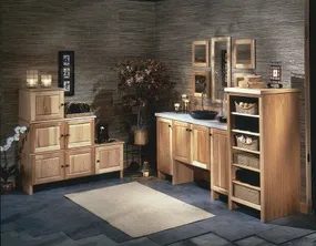
Skip the tourist traps. When pulling together an ethnic look, look at what people actually wear and use. Native textiles offer the real deal. Think paprika red, deep ebony, ivory, spice brown, and gold. You want bold chevron patterns or jewel-toned paisleys. Brilliant silk sari hues work too. Find that handsome hand-loomed texture that speaks to you.
Keep accessories minimal. High-impact items only. Hammered brass. Enamel finishes. Wrought iron. Earthenware. Wooden bowls. Woven baskets. Do this without creating a visual “Babel” of clashing styles.
Beyond the ethnic patterns, tap into the natural world. Whimsical frogs. Elegant herons. Dignified elephants. Tropical foliage. These motifs affirm ecological awareness without feeling preachy. It’s about respect for the source, not just the aesthetic.
And for a touch of inventive local culture? Hunt for artifacts made from recycled industrial products. It’s a hallmark of resourceful communities worldwide. It adds history. It adds soul.
Beach House
Waterfront schemes in the bath are so popular they demand their own category. Water belongs in the bathroom. It’s a natural affinity. That’s why images of the sea—boats, shells, fish—show up everywhere.
But the shell-shocked beach look? That’s a 1950s cliché. It’s dated. Rendering the concept freshly takes thought. If you lean toward traditional styles, American country, English country, Mediterranean, or lodge/cabin vibes lend themselves well to a beach cottage aesthetic.
Whitewashed walls and cabinets. A classic blue-and-white palette. A few vintage accessories, carefully chosen. Carved wooden shore birds. Miniature sailboats. That’s enough to do the job nicely. For a more opulent traditional bath, go for formal neoclassical shell motifs. Use an 18th-century color palette: ivory, shell pink, and taupe.
Contemporary style? The California Spa look is easy. Whites. Neutrals of driftwood and sea sponges. Sea-glass blue-green accents. It brings the look home without trying too hard.
In any of these settings, natural shells work if used in moderation. Don’t be tempted to “improve” them. No dyes. No glue. No fake flowers. A large conch or sawtooth clamshell makes a great soap holder. A clear, heavy brandy snifter filled with the best finds from family beach vacations? That recalls happy memories. Better than any store-bought trinket.
Looking for a timelessly elegant bathroom? Continue on to the next page for a simple and elegant bathroom decorating idea.
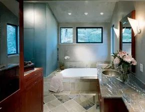
Texture Over Form
Forget the bling. In this bathroom, material wins over decoration. It is a quiet victory, but a decisive one.
The wood cabinets do not shout. Their smooth grain carries the visual weight. Pair that with a frosted-glass shower enclosure and you get natural drama without the clutter. Excessive fixtures are left on the cutting room floor.
Grounding the Space
Look down. The floor tiles set the tone.
They are large format. That choice matters. It reduces grout lines, creating a seamless look that feels expansive. The colors are specific: smoky gray and beige. Think pebbles washed ashore. The mixture is restful. Subdued. It evokes a leisurely stroll along a beach, stripping away the rush of daily life.
The Tub as a Sanctuary
The designer did not stop at the floor.
Those same hazy-hued tiles wrap around the tub. This continuity is key. It blurs the line between floor and fixture. The result is a woodland feel. It grounds the bathing area in something organic.
Resting in warm water, you lean back. You see treetops through high windows.
Privacy is maintained. Light is invited in. The vertical space works for you here.
Why This Works for DIYers
You can replicate this effect without a designer’s eye. It relies on simple choices:
- Limit your palette. Two or three neutral tones create cohesion.
- Use large tiles. Fewer grout lines mean a cleaner look and easier maintenance.
- Prioritize texture. Smooth wood against frosted glass against matte tile. The contrast creates interest without color.
Materials and Safety
If you are tackling this yourself, note the tools.
- Tile saw: Essential for cutting large-format porcelain or stone.
- Level: Critical for avoiding lippage (uneven edges) on big tiles.
- Sealer: For the wood cabinets and grout. Water resistance is non-negotiable in a bathroom.
Safety first. Wear eye protection when cutting tile. Use a vacuum with a HEPA filter to keep silica dust out of your lungs. It is not glamorous. It is necessary.
The high windows require careful installation. Ensure they are sealed properly to prevent leaks. A small drip can ruin the “woodland” vibe fast.
The Result
You get a space that feels curated but not complicated. The eye rests on the grain of the wood. It travels down to the stone-like floor. It lifts to the light filtering through the trees.
It is simple. It is elegant. It works because it lets the materials speak.
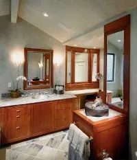
How Dual Vanity Layouts Prevent Bathroom Clutter and Boost Harmony
Empty counters aren’t just an aesthetic choice. They are a functional necessity for maintaining that elusive sense of calm. When clutter invades a bathroom, the first thing to go is peace. The solution isn’t just cleaning harder. It is designing with storage that feels like part of the architecture. Shelves and cabinets should disappear into the walls or blend seamlessly with the joinery. This keeps the visual field clear.
Why Neutral Tones Create a Spa-Like Atmosphere
The color palette plays a massive role in this tranquility. Walls and ceilings painted in soft, neutral shades do more than just look good. They signal the brain to slow down. These pale tones are often associated with Asian interior design philosophies. The idea is simple. Lighter colors give the mind room to drift. They reduce visual noise. This creates a mental space where you can actually relax. It is not just about decoration. It is about psychology. The right shade makes the room feel larger, airier, and less oppressive.
Setting Up Two Grooming Stations for Couples
One of the biggest friction points in shared bathrooms is the morning rush. Two people trying to brush their teeth at one sink is a recipe for conflict. The fix is straightforward: add a second grooming area. Each station needs its own mirror. This simple change eliminates the battle for elbow room. It allows two people to prepare simultaneously.
The vanity area benefits from a specific upgrade. Include a small magnifying mirror. This is not just a luxury. It is a practical tool for detailed tasks. Shaving, applying makeup, or plucking eyebrows becomes significantly easier with proper magnification. It turns a basic mirror into a high-performance grooming station. For couples, this setup means efficiency. No more waiting. No more arguing over space.
Maximizing Storage Without Sacrificing Style
Storage must be abundant. It must also be beautiful. Built-in units work best here. They utilize every inch of wall space without adding visual bulk. Open shelving can work if used sparingly. Closed cabinets hide the daily detritus of life. The goal is to have everything in its place. When items are stored properly, the room retains its clean lines. The design remains uncluttered. This requires discipline. But the result is a space that feels curated rather than lived in.
Essential Tools for a Clutter-Free Bathroom
Creating this environment requires more than just paint and mirrors. You need the right storage solutions. Look for vanity units with deep drawers. These hide toiletries better than open shelves. Install towel bars that hold multiple towels without looking messy. Consider a medicine cabinet with enough depth for bulky items. The key is to choose fixtures that complement the neutral theme. Metal finishes in brushed nickel or matte black can add subtle contrast without breaking the calm.
Where to Find More Design Inspiration
If you are looking to expand these principles to other rooms, there are plenty of resources available. Start with the spaces you use most.
- Kitchen Decorating Ideas
- Dining Room Decorating Ideas
- Home Office Decorating Ideas
- Kids Bathroom Decorating Ideas
- Decorating Styles
For specific bathroom advice, focus on these targeted searches.
- Bathroom Décor
- Designing a Bathroom
- Decorating a Bathroom
General interior decorating guides can also provide broader context.
- Decorating Ideas
- Home Decorating Tips
- Decorate