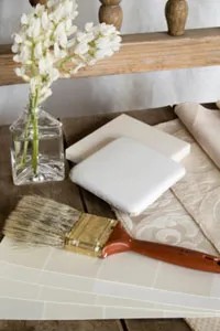
“If you want to sell your home, paint your rooms beige.”
It’s the rallying cry of real estate agents everywhere. And they aren’t wrong. First impressions matter. Presentation matters. Neutral colors spark interest. Bold colors scare people off.
But here is the thing. Humans are wired to react to color. Deeply. Our ancestors used color to survive. Green meant safe. Red meant danger or ripe fruit. We don’t live in the savanna anymore. We live in suburbs. But those emotional cues? They’re still in our DNA.
A hue you love might make a buyer uncomfortable. The darker the color, the stronger the reaction. Pure white? It does nothing to the emotions. It’s safe. It’s also boring. And dirty. An all-white home feels sterile. It shows every scuff. It feels cold.
You can have both. You can keep the emotion. You can still sell the house. You just need to know how to use color psychology without going overboard.
Why color psychology matters when selling a home
Color psychology is real. It’s the study of how colors trigger emotions in humans.
Yellow is tricky. Bright yellow can actually upset small children. Light yellow? That’s safe. It’s gender-neutral. It’s calm. Blue brings calmness. Serenity. But also coldness. Red is energy. Excitement. Love. Anger. Warfare.
You don’t want your dining room to feel like a battlefield. You want it to feel like a place where people connect.
Understanding these traits helps you plan. It helps you show off your home’s best features. But knowing the theory is one thing. Applying it is another.
How to choose paint colors that appeal to most buyers
Start with the room’s purpose.
What does the bedroom say? Is it for rest? For adults? Or is it a bright playroom for kids?
What about the kitchen? Is it a gathering place? Or is it a high-tech machine for fast meal prep?
Ask these questions. Define the mood. Then match the color to that mood.
Here is the rule: stick to the middle or lighter ends of the color spectrum. Don’t paint the walls a deep forest green. It will feel heavy. It will feel like a cave. Keep it light. It keeps the space open.
Now you design.
You have furniture. Flooring. Light from the windows. Your budget.
You don’t need to paint everything bold. In fact, you shouldn’t.
Use one or two items to showcase bold color. A chair. A rug. A piece of art. Offset that with neutral walls. Neutral furnishings.
Restraint is key.
A bold color used too much becomes overwhelming. Too many complementary colors make a sparse room look cluttered. Busy. Messy.
Limit your palette. Three colors max.
- A bold accent.
- A middle-tone to frame it.
- A neutral background for the walls.
This breaks the beige blahs. It adds character. But it doesn’t alienate buyers. It gives them a canvas. They can imagine their life there. They don’t have to imagine repainting your dramatic purple walls.
Which rooms get which colors?
Not every room gets the same treatment.
Living Room
This is the main stage. Keep it inviting. Soft blues or warm grays work well. They’re calming. They’re safe. Add a pop of color with a throw pillow or a lamp.
Kitchen
Kitchens are high traffic. They get dirty. Light colors hide less dirt but reflect light better. If you want efficiency, go cool. If you want warmth, go earth-tone. But keep the cabinets light. White or cream is standard for a reason.
Bedrooms
Sleep requires calm. Blues and greens are best. Avoid reds. Red raises blood pressure. It’s energetic. You don’t want that when you’re trying to dream.
Bathrooms
Cleanliness is the vibe. White, light blue, soft green. Make it look spa-like. Not hospital-like. Add wood tones or warm towels to soften the sterile feel.
The tools you need to get it right
You don’t need a degree in design. You need a paint chip. And a good light.
Natural light changes everything. A color that looks great in the store looks different in your north-facing window.
Take samples home. Paint a small patch. Watch it at morning. Noon. Night.
If it looks weird at 7 PM, don’t use it.
Buy good paint. Cheap paint peels. It stains. It looks flat. Spend the extra money for a quality latex or acrylic. It covers better. It lasts longer.
Use painter’s tape. Mask off the trim. Cut in carefully. Two thin coats are better than one thick one.
Don’t rush it.
Why neutral doesn’t mean boring
Agents say beige. They mean “safe.”
But safe doesn’t have to mean dull.
You can have texture. You can have interesting lighting. You can have bold furniture. The walls just need to be a backdrop.
Think of your walls like the sky. The sky isn’t the point. The clouds are. The birds are. The sun is.
Your walls support the life inside the house.
If you paint them too loud, the room fights the furniture. The room fights the buyer’s imagination.
Keep the walls quiet. Let the rest of the house speak.
“The closer your home’s colors are to pure, neutral white, the less they will emotionally affect visitors.”
That’s the goal. Not zero emotion. Controlled emotion.
You want the buyer to feel comfortable. Not excited. Not angry. Just… at home.
It’s a strange thing. You want them to feel at home in a house that isn’t theirs.
Color is the trick. It’s the bridge.
So don’t just paint it beige. Paint it warm gray. Paint it soft sage. Paint it a light, airy blue.
Just don’t paint it red. Unless it’s an accent wall. And even then, think twice.
You’re selling a feeling. Make sure it’s a good one.